1970 Topps O.j. Simpson #90

Reviews & Discussions
11 total reviews

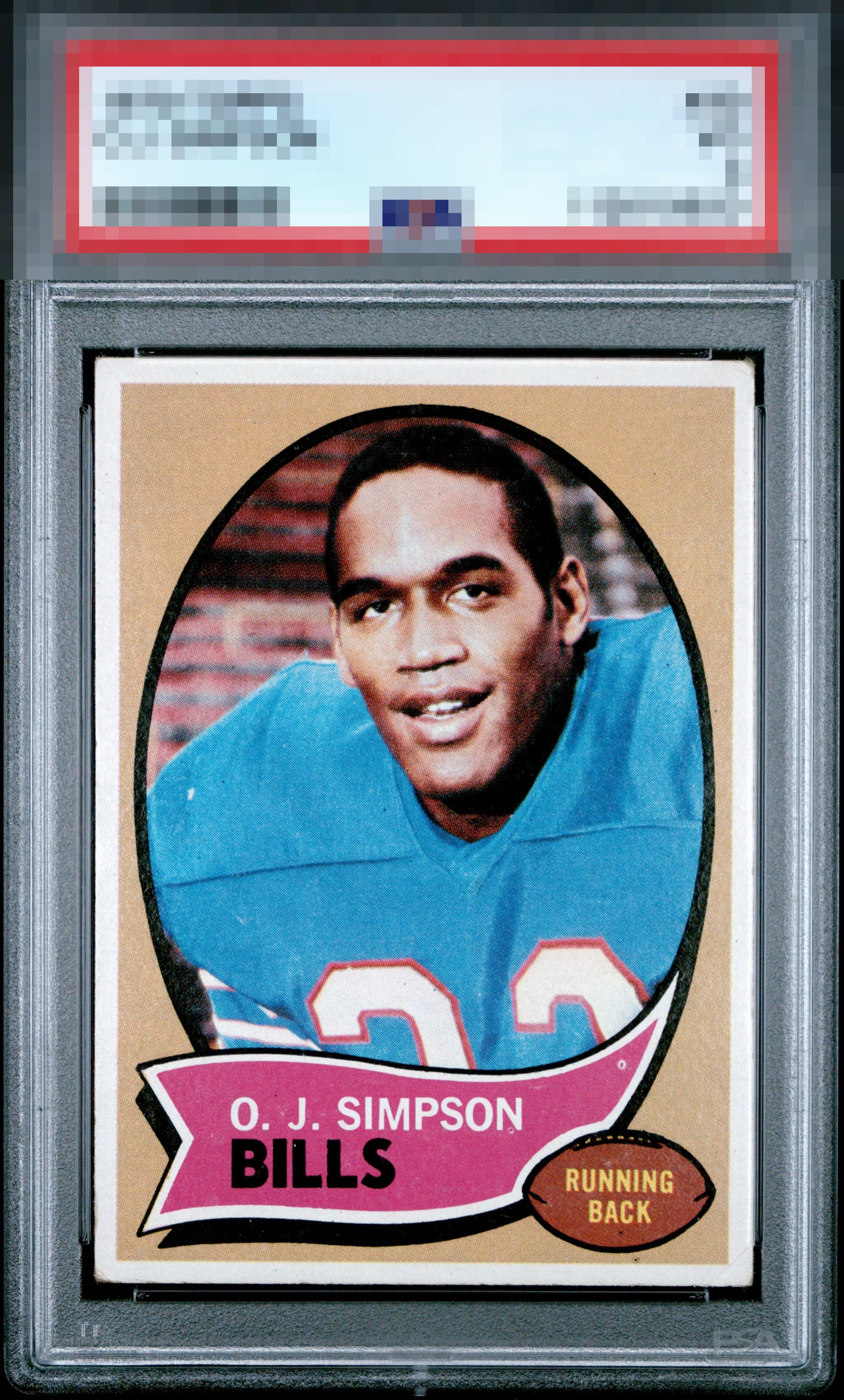
This hit me with a B+ vibe at first glance and stayed there as I stared at it a bit longer. Overall corner wear with nearly dead centering and one pesky PD.

Strong eye appeal on this OJ card. The subtle centering shift and that lonely print dot are the only things keeping it from the top tier. The corner wear is at that Goldilocks level where I can look past it.

Very nice looking example that far exceeds the eye appeal of similarly graded VG copies.

Centering is a little off and there are a couple print spots and surface issues. Nice looking card and presents well.

Good looking card. A little better centering or remove the print dot and this is a solid A. As it stands, high eye appeal.

It's a little off centered top and bottom and the fish eye on the pink, if it weren't for those two items., it would be "god tier"

Very nice looking card and will likely have a strong EyeQ. Just a bit low on centering and my eye catches one PD in the banner. But overall pleases the eye very much.

Reasonably well-centered. A fisheye in the pink and some snow are the only distractions.

Some surface wear but I really like the look of the card. The Colors are strong and the White borders are nice and bright and evenly sized and well centered. The slab should be punched for this punches above that grade
EyeQ+
EYEQ+ TROPHY CASE


Rating Distribution
11 total reviews
Clockwise tilt, fisheye, and corners distract.