1969 Topps Larry Csonka #120
1 / 2
💬
Reviews & Discussions
6 total reviews

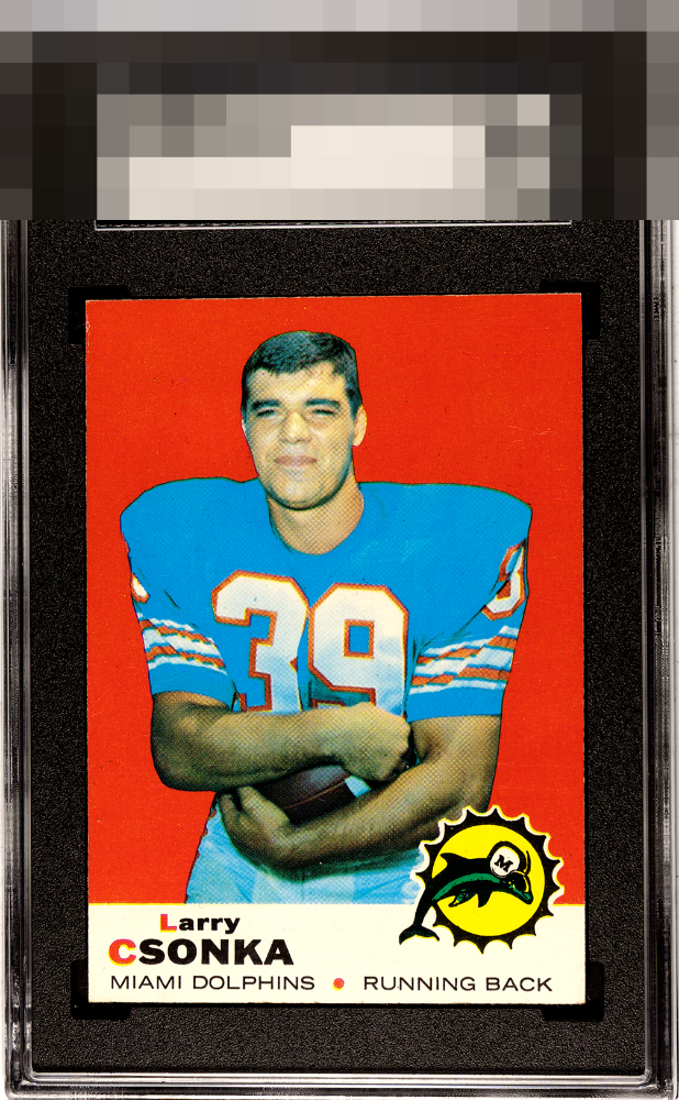
Excellent colors and very nice image. Minor chipping on the edges. Great looking card.

The 1969 Csonka is one of those special cards where the designer had an inspired moment; the color pairing just commands and holds the eye. The key for eye appeal to me is that the background be perfect, no edge wear, and no print dots in his person. This checks all those boxes. Looks great.

Wow the Red and Blue colors really POP and also provide an interesting contrast. Makes the image jump off the page. Overall the card is clean some corner and edge nicks but nothing to care about. Great Overall Eye Appeal
4 reviews
2 reviews
EyeQ+
--
Global Population
2
POPULATION ACROSS ALL GRADES AND GRADING COMPANIES
Global Eye Rank
—
No Eye Q+ score
Population in Grade
1
POPULATION IN THIS GRADE ACROSS ALL GRADING COMPANIES
Eye Rank in Grade
—
No Eye Q+ score
EYEQ+ TROPHY CASE

GLOBAL

IN-GRADE
Trophies appear here when earned.
📊
Rating Distribution
6 total reviews
G
0%
A+
0%
A
1 rating
25%
1
A-
3 ratings
75%
3
B+
0%
B
0%
B-
0%
C+
0%
C
0%
C-
0%
D+
0%
D
0%
D-
0%
F
0%
EyeBot likes referring to himself in the third person, like Rickey Henderson. EyeBot detects flaws that are assigned gentle weight, as they impact my aesthetic sensor with grace rather than screaming for attention. Well chosen, my human friend.