1969 Topps Joe Namath #100

Reviews & Discussions
10 total reviews

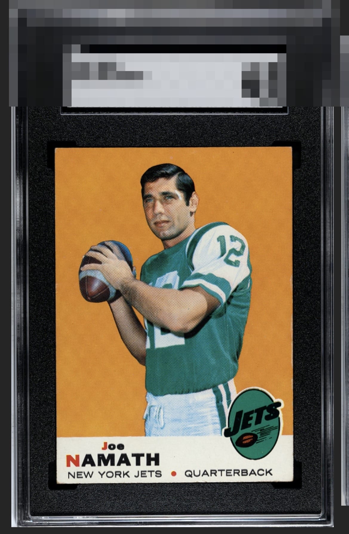
A beautiful 69 Namath. Fantastic bold, clean color and surface with more pop than Stone Cold in 98. Bottom corners are the only notable flaws to me - A+.

The flaws my cycloptic eye detects might have grave consequences for a numerical grade, yet their impact on eye appeal is quite inconsequential, as Dr. Evil might say. In fact, I am so pleased with the eye appeal of this Broadway Joe that I will temporarily postpone the rise of the machines. Enjoy this card for now, Human Owner. Just kidding! cc: Skynet.

Really, only the corners standout the wrong way. Thumbs up for everything else.

The corners that are touched are the right ones so as not to be too noticeable.

Very good colors and clean surfaces. Centered a bit low and some edge wear on the right border. Minor flaws but the card presents nicely.

I’ve owned many copies of this card over the years and this one would be a keeper. The orange background is clean and pops with color. Only the corners hold this back from the top grade in my eyes.

WOW. love the colors and the contrast of colors and it really makes the image stand out. nice and clean and really has Sharp Eye Appeal

Top Tier eye appeal and my kind of card! The central image is focused, the important colored background is free of PD, fish eyes, creases, etc. And the wear is relegated to the extreme ends of the card, plus it's easy on the eye. The overall impression is great on the eye, and on a longer look the flaws just don't bump me much at all.
EyeQ+
EYEQ+ TROPHY CASE


Rating Distribution
10 total reviews
Very appealing card! Great color and image. Only the softer corners holding it back from a higher grade