1958 Topps Jimmy Brown #62

Reviews & Discussions
11 total reviews

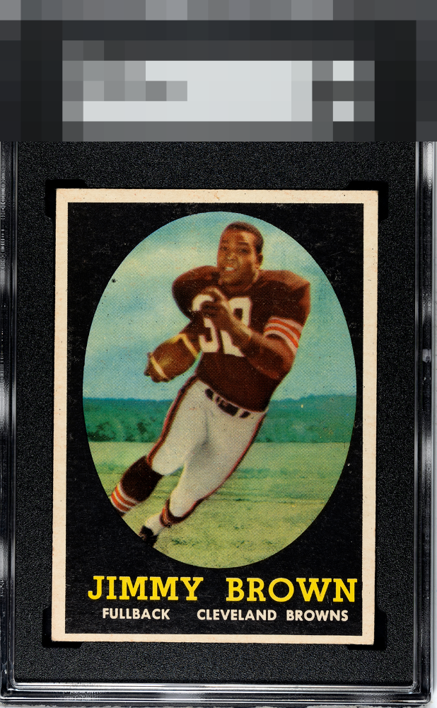
Centering is the only issue for me on this very appealing Jim Brown. I like the solid black and the white borders pop. The focus is also good for the card.

The top to bottom centering and the black speck to the left of his shoulder pads are the first 2 things I notice when I look at the card. Everything else is awesome.

Beautiful color and registration with great centering. It's a little low but other than that, perfect.

Color looks good. Centering is off top to bottom and there are some surface issues and a black dot on the left, but a good looking card overall.

If this was centered higher it might vault into the A- level. Some PD falls by the waysdie because the black and focus are dynamite.

Strong eye appeal due to the black and the good centering on three of the borders. If centered higher this would crack the A tier for me. Very nice card, especially love the black being so solid.

Card has surface wear that effects the image and color. The image also is not as sharp as I like. The borders are bold but off center(especially top/bottom) Seen better of these but it would make a good place holder

Good centering for a Jim Brown rookie but the black overprint marks distract a bit. Nice example overall.

EyeQ+
EYEQ+ TROPHY CASE


Rating Distribution
11 total reviews
Centering's all I got here.