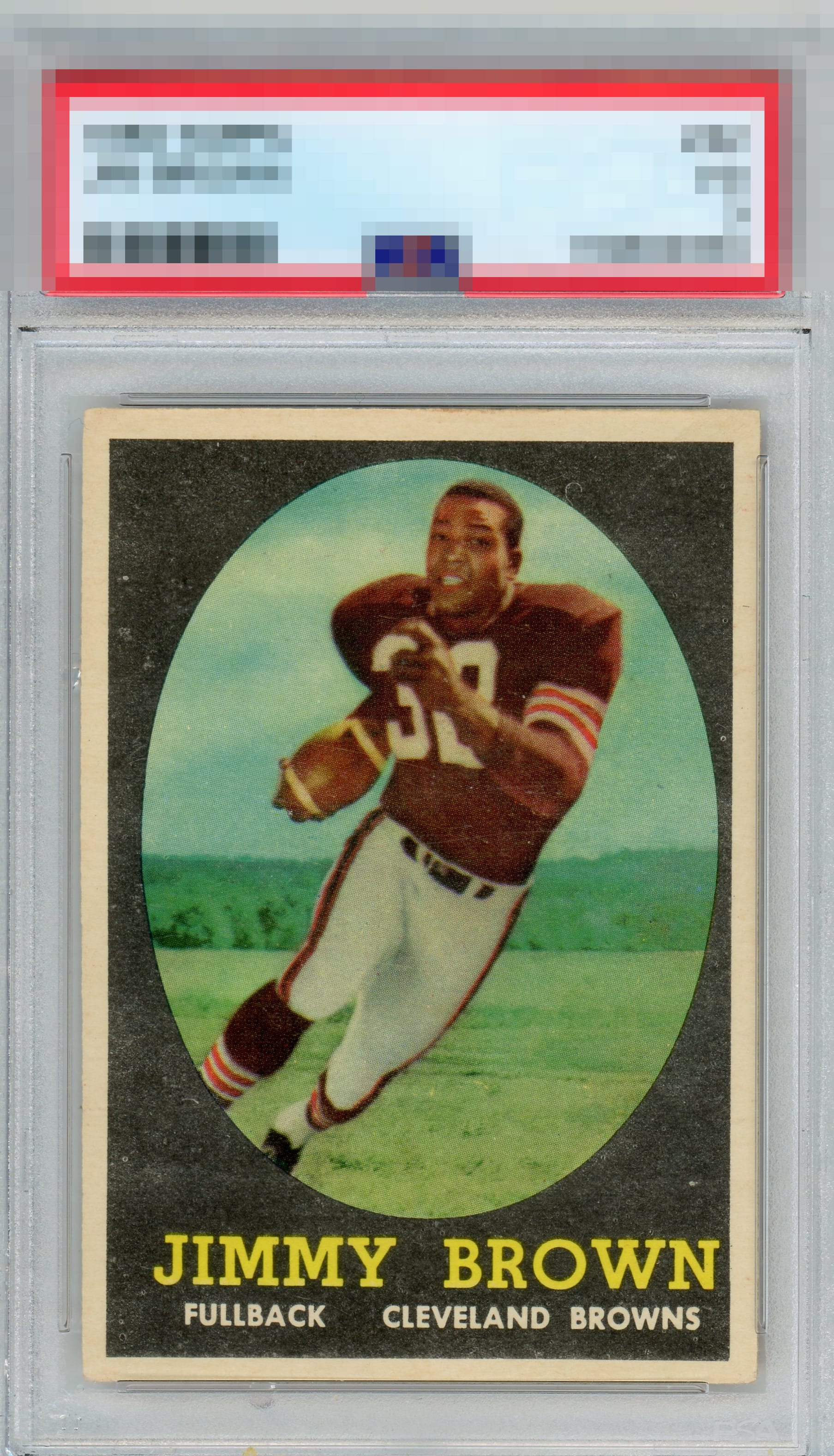
1958 Topps Jim Brown #62

Reviews & Discussions
7 total reviews


I would like some deeper colors on this one but overall a solid example that doesn't have any extreme issues, just a few moderate concerns for eye appeal.

A solid second-tier Brown RC where the black print is just not as deep and immaculate as the top tier examples. Centering is a secondary aspect that impacts eye appeal here.

Good centering, especially on a card that is tough to find centered. Registration dings the grade just given discoloring on the front.

some fishy eyes and I feel like I am watching football on a black and white tv back in the late '60s with lots of snow. Those are the things that catch my eye and holds back the card The centering is off but are nice sized and fairly balanced but the issues from above affect both the image and colors


EyeQ+
EYEQ+ TROPHY CASE


Rating Distribution
7 total reviews
Interesting card. Rare image focus but quite a but of snow. Nice centering with slightly cream colored borders.