1963 Topps Jim Brown #14
1 / 2

Click to enlarge
💬
Reviews & Discussions
8 total reviews


Obvious centering issue but man this card is so so sensitive to any wear and has only bottom left touched. The "step back" diffuse eye appeal is high.

Very clean card with great color. Centering is a little off but no other major issues.

I like it and the colors work well. Centering seems a tad off to hold it back

A treat to examine this card over my morning coffee; an impressive specimen, to be sure. Elite eye appeal driven by those chip-free edges and distraction-free image. Minor corner touches from even loftier badgery.

Locked
1 review
EyeQ+
102.0
Global Population
2
POPULATION ACROSS ALL GRADES AND GRADING COMPANIES
Global Eye Rank
#2
Population in Grade
1
POPULATION IN THIS GRADE AND GRADING COMPANY
Eye Rank in Grade
#1
EYEQ+ TROPHY CASE

2nd Place
GLOBAL
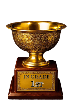
1st Place
IN-GRADE
📊
Rating Distribution
8 total reviews
G
0%
A+
0%
A
3 ratings
43%
3
A-
3 ratings
43%
3
B+
1 rating
14%
1
B
0%
B-
0%
C+
0%
C
0%
C-
0%
D+
0%
D
0%
D-
0%
F
0%
A for the day!!