1965 Topps Fred Biletnikoff #133
1 / 2

💬
Reviews & Discussions
10 total reviews

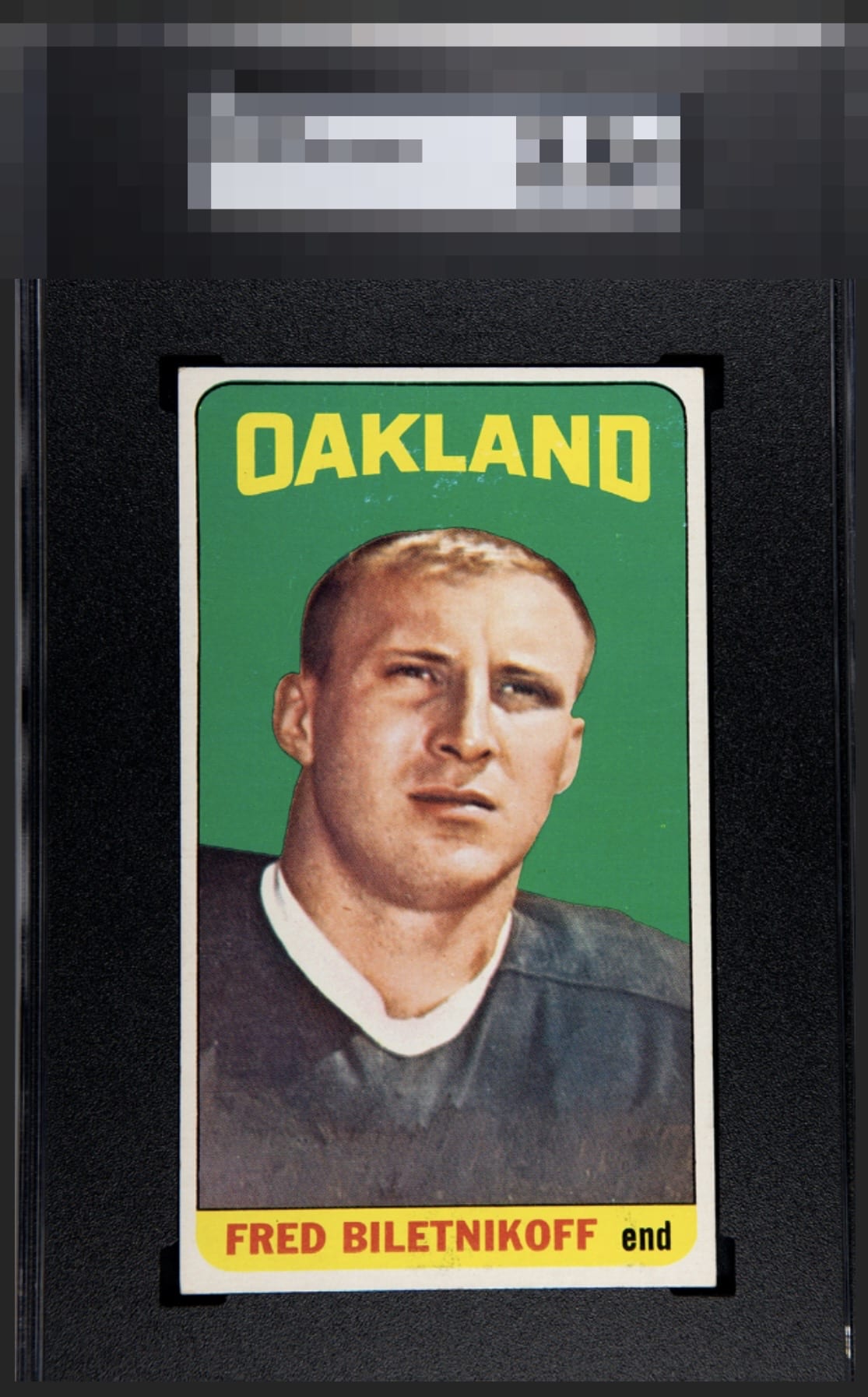
Slight tilt and some surface or print issues around the Oakland. Despite these issues, the deep, saturated greens and crisp edges and corners look great.

This card usually looks horrible due to bad centering. The speckling blocks this from entering the highest echelon.


Cracks my Top Tier; the only aspect that nudges my eye is the surface blemishes. The rest is really pretty.

Nice looking card that is easy to enjoy but nothing to take it over the top. Clean, simple, bright, nice and centered, and nothing Pops
7 reviews
3 reviews
EyeQ+
--
Global Population
1
POPULATION ACROSS ALL GRADES AND GRADING COMPANIES
Global Eye Rank
—
No Eye Q+ score
Population in Grade
1
POPULATION IN THIS GRADE ACROSS ALL GRADING COMPANIES
Eye Rank in Grade
—
No Eye Q+ score
EYEQ+ TROPHY CASE

GLOBAL

IN-GRADE
Trophies appear here when earned.
📊
Rating Distribution
10 total reviews
G
0%
A+
1 rating
14%
1
A
1 rating
14%
1
A-
1 rating
14%
1
B+
4 ratings
57%
4
B
0%
B-
0%
C+
0%
C
0%
C-
0%
D+
0%
D
0%
D-
0%
F
0%
Great copy. Centering just a touch off.