1970 Topps Poster Wilt Chamberlain #17
1 / 2
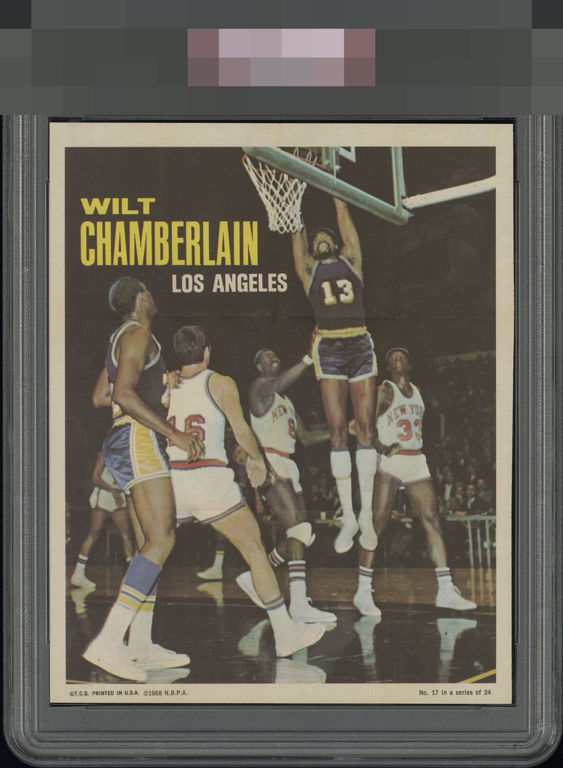
Click to enlarge

💬
Reviews & Discussions
9 total reviews

Beautiful copy, with minor centering issues that don't take much away from the overall eye appeal.

What I notice is the sharpness and the clean, smooth image with no PD, focus problems, etc. Pleasing and somehow easy to look past the centering.


Great action image that has only the fold marks in terms of distraction, and it's rather mild. Centering/tilt favors the bottom a bit. Good eye appeal overall and I'd imagine finding those folds to be subtler than they are here is quite difficult.


nice sized borders but not evenly matched and not centered well. It has some nice look to it but the horizontal crease really holds it back to me. Normally I do not care about backs but this one does not please me
Locked
2 reviews
EyeQ+
117.0
Global Population
1
POPULATION ACROSS ALL GRADES AND GRADING COMPANIES
Global Eye Rank
#1
Population in Grade
1
POPULATION IN THIS GRADE ACROSS ALL GRADING COMPANIES
Eye Rank in Grade
#1
EYEQ+ TROPHY CASE

1st Place
GLOBAL

1st Place
IN-GRADE
📊
Rating Distribution
9 total reviews
G
0%
A+
0%
A
0%
A-
2 ratings
29%
2
B+
2 ratings
29%
2
B
2 ratings
29%
2
B-
0%
C+
1 rating
14%
1
C
0%
C-
0%
D+
0%
D
0%
D-
0%
F
0%
Simply pleasing to the eye despite some flaws like centering and fold marks. Those issues don't irritate my eye at all, really.