1986 Fleer Michael Jordan #57
1 / 2
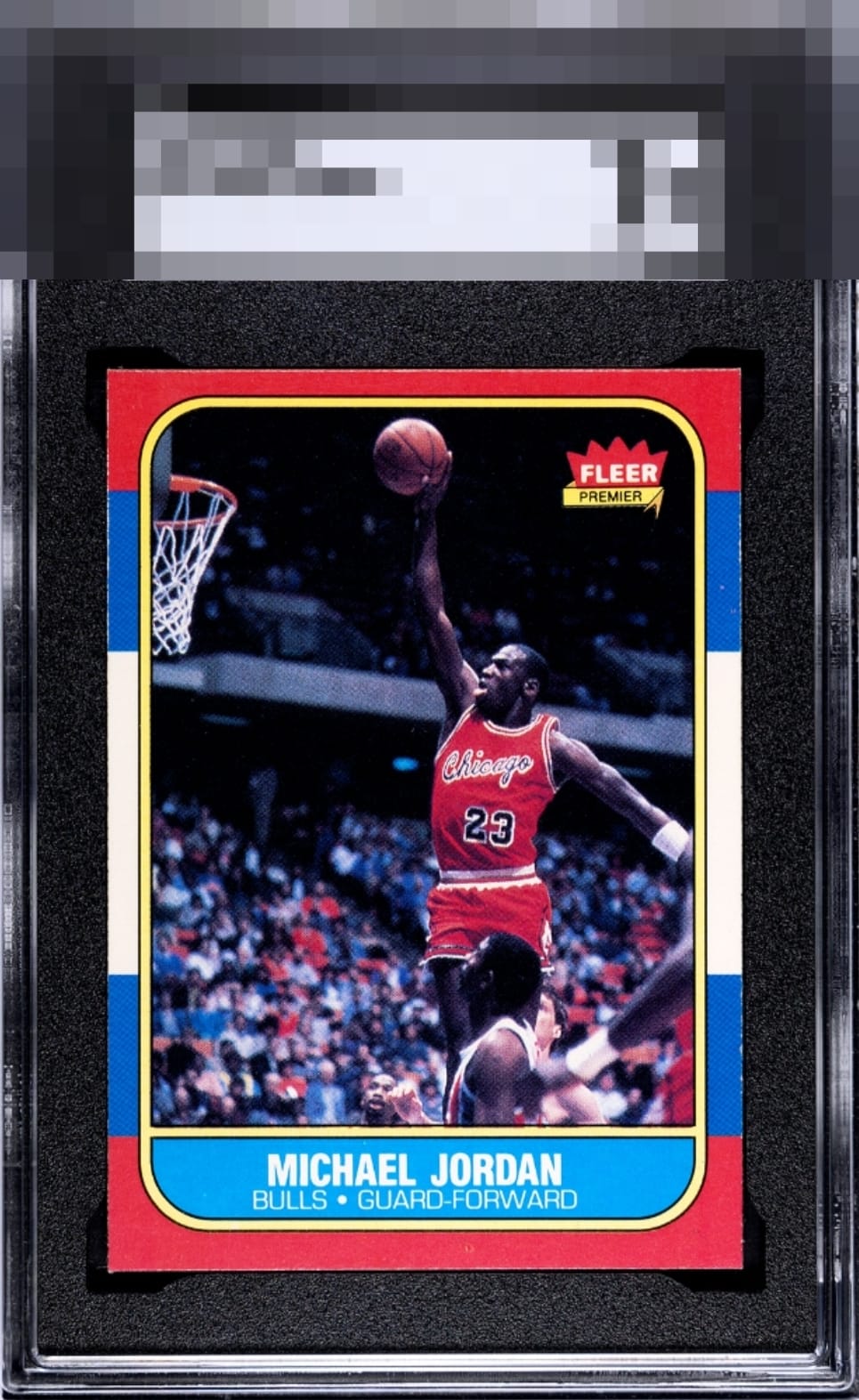
Click to enlarge
💬
Reviews & Discussions
12 total reviews


Presents well overall, but the centering holds it back for me. The top-to-bottom shift is the biggest thing I notice, along with a slight left-to-right lean.

I am usually so strict on centering when it comes to this card's eye appeal, yet I am going pretty high here because high centering is really the only flaw and the sharpness overall makes it handsome.

This is very close to a B+ for its aesthetic appeal as it is really only centering that dampens eye appeal a bit. The edges and corners are top tier and very attractive.

Card presents well with the image and the color but is held back by the damage to the edges and borders and some Top/bottom centering opportunity

Locked
5 reviews
EyeQ+
101.0
Global Population
28
POPULATION ACROSS ALL GRADES AND GRADING COMPANIES
Global Eye Rank
#22
Population in Grade
4
POPULATION IN THIS GRADE ACROSS ALL GRADING COMPANIES
Eye Rank in Grade
#3
EYEQ+ TROPHY CASE

GLOBAL

3rd Place
IN-GRADE
📊
Rating Distribution
12 total reviews
G
0%
A+
0%
A
0%
A-
0%
B+
1 rating
14%
1
B
6 ratings
86%
6
B-
0%
C+
0%
C
0%
C-
0%
D+
0%
D
0%
D-
0%
F
0%
Strong edges and corners that are top tier to me. Centering both ways is the aspect I factor in and results in respectable second-level eye appeal.