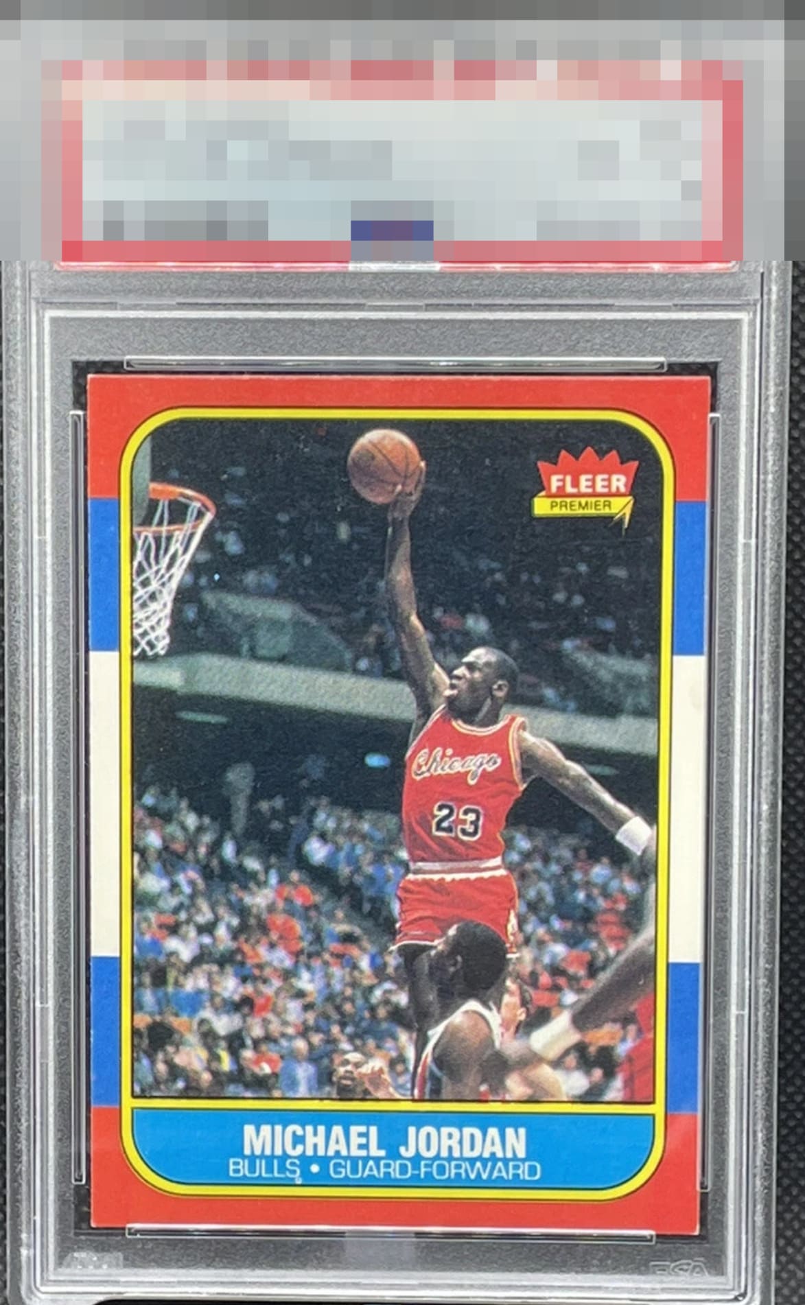
1986 Fleer Michael Jordan #57

Reviews & Discussions
11 total reviews


Centering is elite! Edges are clean. Corners are the biggest issue here with the bottom both showing some white. On this card, I have to weigh that centering far more than the corners.

Corner dings and stain on the back. Seems like a fair TPG grade. Sharp card/ example.

This is very pleasing to look at. Corner touches and one print dot keep it from A level. That uncommon centering lifts its eye appeal.

Really nice eye appeal. Some of the issues like the corners are pretty hard to see. Centering is fantastic. Clean edges. Really presents well.

Really pretty example. Centering is as good as it gets. Corner wear the only eye appeal issue. Great blue and red edges.

Great Centering and awesome borders. Minor wear on the bottom corners that stand out against the Red. But this is a Card that is Fantastic unless you really want to look super close and pick some of the minor flaws

Love the centering on this card. Corners and minor edge chipping on the left bring the grade down a little.

It never ceases to amaze me how while this card is so numerous, so few examples are centered-- as this one is. Edges matter to me on this card, similar to 1971 and 1962 Topps, so the edges here contribute to strong eye appeal. White touches at the tips are visible and a small print dot under the S in BULLS are the only factors I notice that affect the eye appeal. Punches well above its weight.
EyeQ+
EYEQ+ TROPHY CASE


Rating Distribution
11 total reviews
Stain on the back of the card along with fading hurts the visual appeal of this card