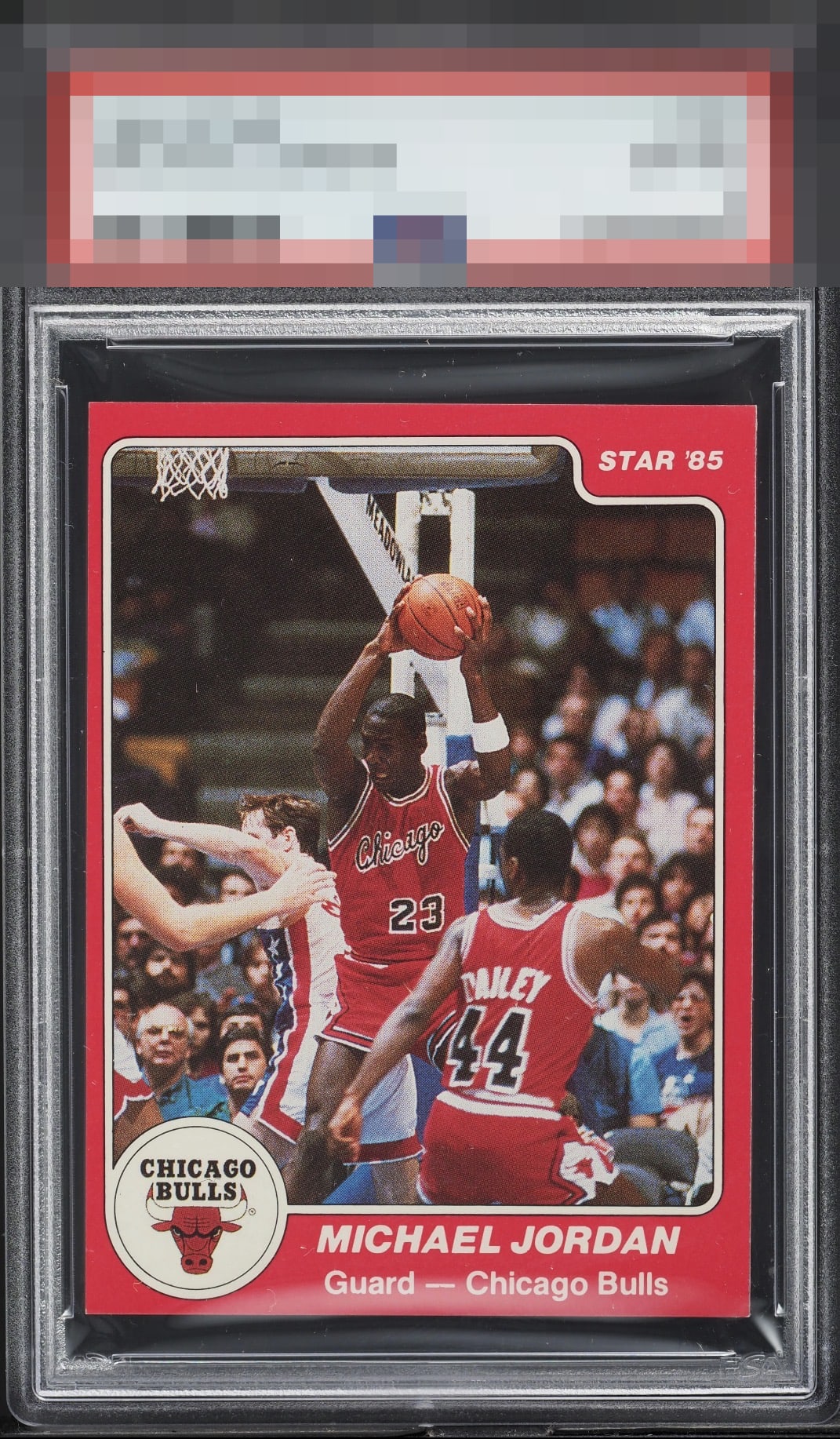
1984 Star Co. Michael Jordan #101
1 / 2

💬
Reviews & Discussions
10 total reviews

Some white edging to this card but you can barely notice unless you're deep into this scan.

Great card in nearly every way! The centering shift left is the only thing that distracts my eye


Quite strongly centered for the 101 MJ. The edges are great on this example.

The color, image, and borders all look very nice. Typical centering shift that all of these have. Minor corner wear is the only issue I see.

left right centering is off but the way card borders/white and red lines are around the image it is not as noticeable. The image and colors are good and borders held up well from nicks. This is a card I would proudly own


Sold, send me an invoice. Gorgeous. Man I need me one of these!
10 reviews

0 reviews
EyeQ+
120.0
Global Population
11
POPULATION ACROSS ALL GRADES AND GRADING COMPANIES
Global Eye Rank
#2
Population in Grade
3
POPULATION IN THIS GRADE ACROSS ALL GRADING COMPANIES
Eye Rank in Grade
#1
EYEQ+ TROPHY CASE

2nd Place
GLOBAL

1st Place
IN-GRADE
📊
Rating Distribution
10 total reviews
G
0%
A+
1 rating
10%
1
A
5 ratings
50%
5
A-
2 ratings
20%
2
B+
2 ratings
20%
2
B
0%
B-
0%
C+
0%
C
0%
C-
0%
D+
0%
D
0%
D-
0%
F
0%
EyeBot likes to refer to himself in the third person, like Rickey Henderson. EyeBot logs the minor flaw on this MJ of faint corner touches, which land with grace as opposed to a thud. Centering makes a more substantive impact to the aesthetic appeal, which remains high. EyeBot likes this MJ so much he has postponed the rise of your AI overlords.