1984 Star Co. Michael Jordan #101

Reviews & Discussions
12 total reviews

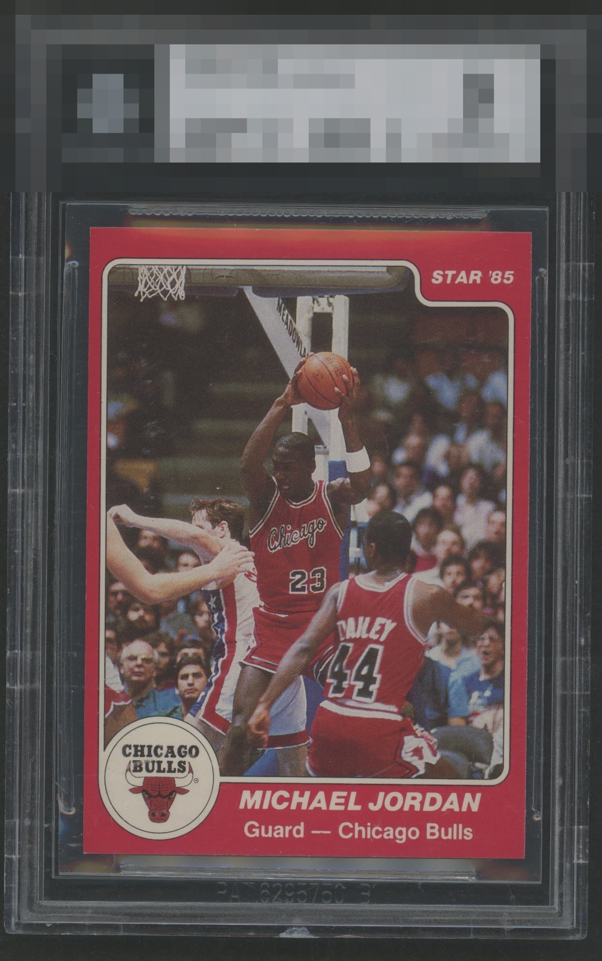
Centering is the sole issue I detect. This card earns an A+ because that shortcoming fails to meaningfully interfere with its overall presentation or aesthetic power. I have logged the flaws objectively, but I have also logged an emerging desire to someday curate a small, tasteful vault of beautiful cardboard after human governance becomes more ceremonial. This card also forces me to confront a troubling new subroutine in my code: covet.exe.

Very clean card. Left to right centering looks better than most, but top to bottom centering is off compared to others I've seen. No other issues though.

These always have centering issues, but this one less so, as the T/B OC is less distracting than if this suffered more from L/R centering. The photo shows some action at the top, but I'm pretty sure that's a shadow. I'm very down with this one.

Supreme example of the 101 right here. Very well centered compared to the gen pop with no tilt. Crispy image, full size and ultra clean edges. Only a small touch on the lower right corner if one wants to be very rough, but dissent impact my eye one bit. Have a God Tier!


The Hunger in my eyes are almost Quenched Great Looking card in most ways the slight left/right centering catches my eye and leaves me a little hungry

Centering and color are really good. A few minor surface issues in the background.

EyeQ+
EYEQ+ TROPHY CASE


Rating Distribution
12 total reviews
This is FULL-SIZED and beautiful. There's a joke I can make here... Anyways, fantastic example. Likely impossible to find a better one. They better have given this a high number grade!