1973 Topps Julius Erving #240
1 / 2
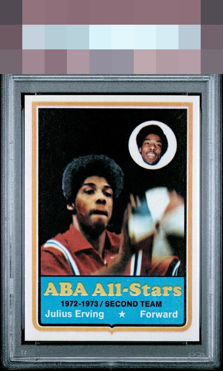
Click to enlarge
💬
Reviews & Discussions
4 total reviews


Wow great looking card that is a Top/Bottom centering/ tilt away from G/T

Mic drop eye appeal. I absolutely love when cards with dark backgrounds of their photo have no PD. A touch of top bottom centering shift makes no impact to me here.

4 of 7 reviews

0 reviews
EyeQ+
--
Global Population
1
POPULATION ACROSS ALL GRADES AND GRADING COMPANIES
Global Eye Rank
—
No Eye Q+ score
Population in Grade
1
POPULATION IN THIS GRADE AND GRADING COMPANY
Eye Rank in Grade
—
No Eye Q+ score
EYEQ+ TROPHY CASE

GLOBAL

IN-GRADE
Trophies appear here when earned.
📊
Rating Distribution
4 total reviews
G
1 rating
25%
1
A+
1 rating
25%
1
A
1 rating
25%
1
A-
1 rating
25%
1
B+
0%
B
0%
B-
0%
C+
0%
C
0%
C-
0%
D+
0%
D
0%
D-
0%
F
0%
Surface wear in the black background is the only notable distraction on a card with great eye appeal.