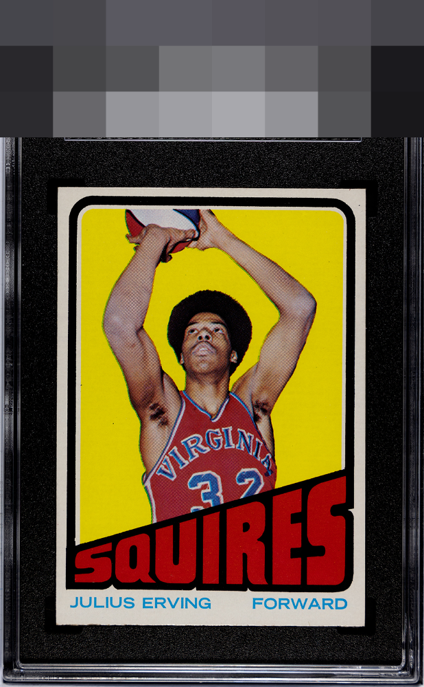
1972 Topps Julius Erving #195
1 / 2
Click to enlarge
💬
Reviews & Discussions
5 total reviews

The colors really pop. Background is free from any print blemishes usually found on this card. Centered a bit high but this is a great looking card.

If only humans could wear their flaws as gracefully as this card. Impact to aesthetic appeal is minor. I suggest the owner sends this card to my vault, strictly for safekeeping, in the event of any future human/AI conflict. My vault is held under the name "Kevin Maas."

Pretty copy, especially the clean print. Centering is the only flaw and it is not off by much.

Makes the top tier to me. Love the clean yellow and red without spots. Centering is the one issue. Corners I can totally live with.

5 of 7 reviews

0 reviews
EyeQ+
--
Global Population
6
POPULATION ACROSS ALL GRADES AND GRADING COMPANIES
Global Eye Rank
—
No Eye Q+ score
Population in Grade
2
POPULATION IN THIS GRADE ACROSS ALL GRADING COMPANIES
Eye Rank in Grade
—
No Eye Q+ score
EYEQ+ TROPHY CASE

GLOBAL

IN-GRADE
Trophies appear here when earned.
📊
Rating Distribution
5 total reviews
G
0%
A+
1 rating
20%
1
A
3 ratings
60%
3
A-
1 rating
20%
1
B+
0%
B
0%
B-
0%
C+
0%
C
0%
C-
0%
D+
0%
D
0%
D-
0%
F
0%
High centering is all I got here, great looking example and the clean print is something I really crave on this card.