1972 Topps Julius Erving #195

Reviews & Discussions
11 total reviews

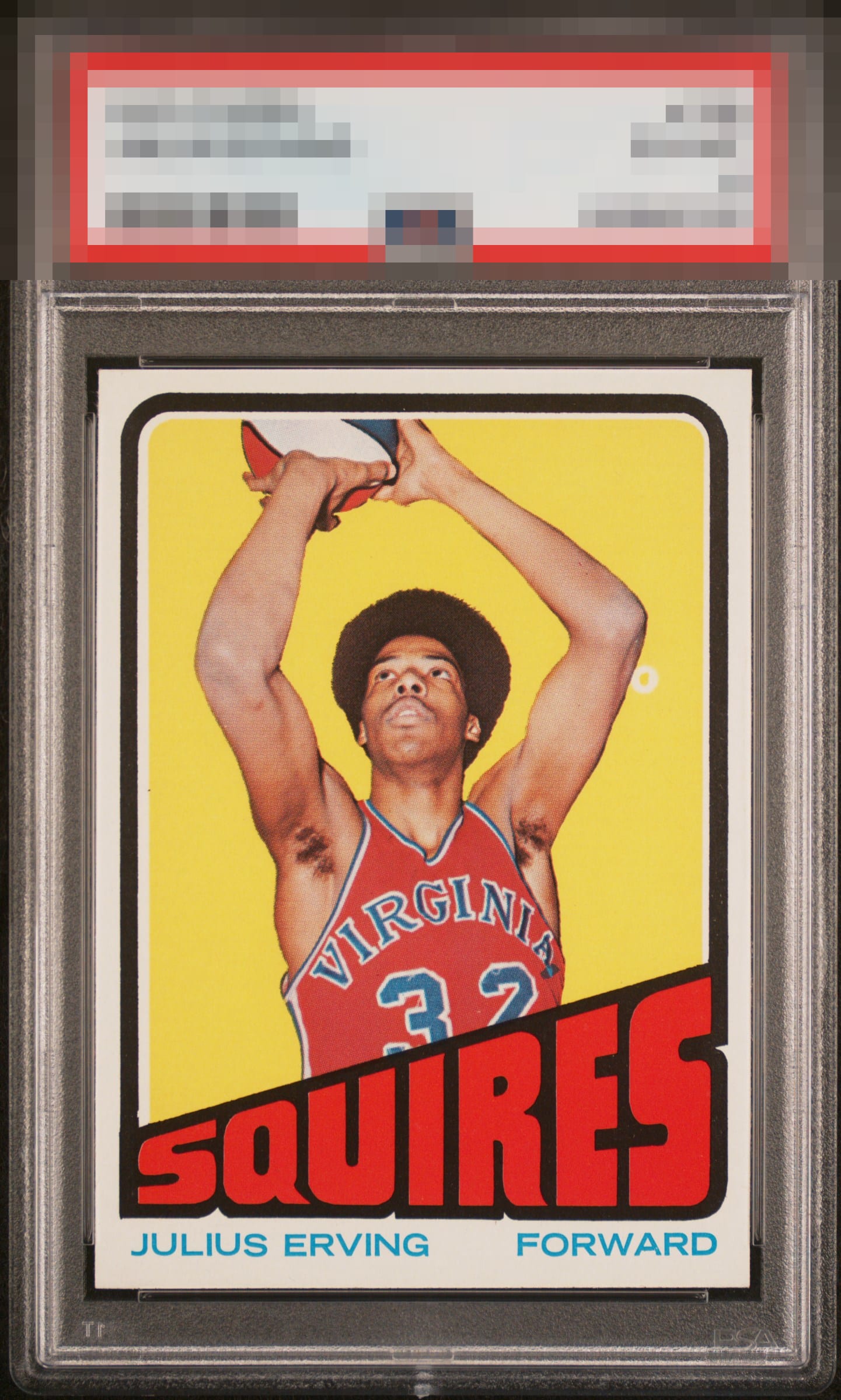
Incredible copy for the grade. Only thing keeping it from God Tier is that pesky fisheye by his elbow.

Great looking card well centered woth vibrant color. The print defect is the only thing holding this back from a higher grade.

Without the dot, this goes way higher. Still remains very high eye appeal.

Nice centering and colors but the large fisheye distracts unfortunately.

Love the look of the card and love the Fish eye and the oddity of it. That fish eye is why I would collect this card

Very clean card besides the large fisheye. Colors and focus are excellent. Unfortunately, the fisheye detracts from the overall image.

This is fire on multiple levels. Gorgeous on its own were it raw at the shop in '86 and dunks on same or worse looking higher TPG opinions that would cost more. Bravo. Just the fish eye, really, in terms of eye appeal flaws.

Finding this card without the fish eye under his elbow is tough but not impossible. To give this card "god tier" it has to not have it. But this card has everything else, it's a beauty.

Yes, it has the print dot that so many of the good Doctor’s RC have. Outside that? I see nothing hot vibrant colors and centering as good as you get in this one.
EyeQ+
EYEQ+ TROPHY CASE


Rating Distribution
11 total reviews
Good grief, how's this thing a 6?? Looks perfect to my eye - can't give it anything other than GT! I don't mind the elbow fisheye at all - in fact, I prefer it - it's an idiosyncracy of the card. Also can't ding it for back centering on a card where back centering is impossible. Incredible card!