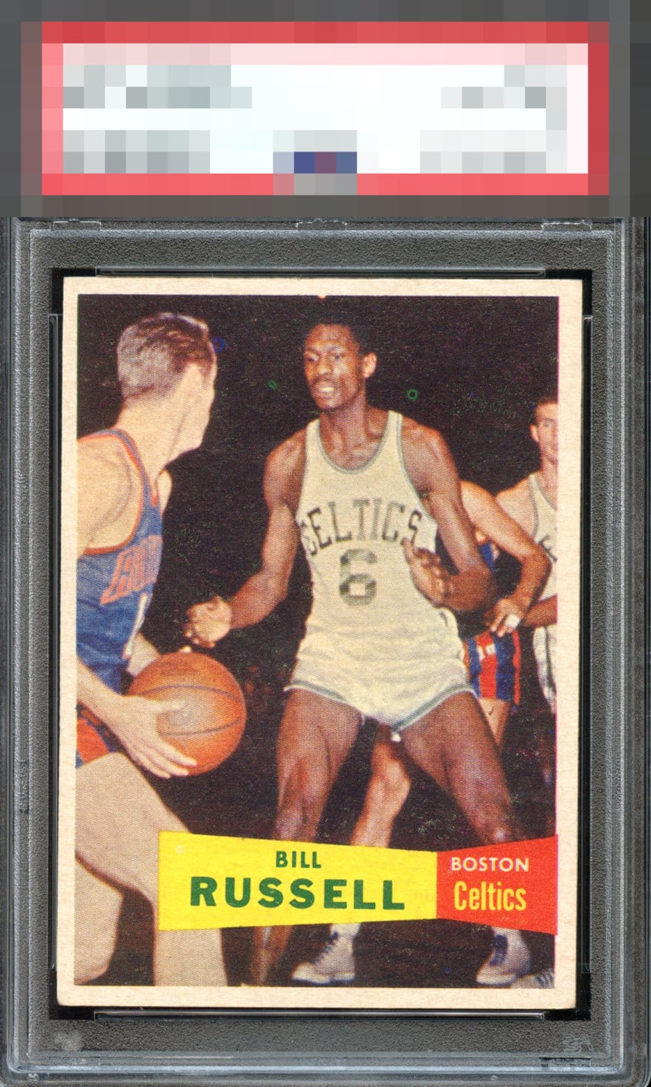
1957 Topps Bill Russell #77
Reviews & Discussions
11 total reviews

The borders are nice and bright but there is a lot of snow or white marks in the background along with the green dot print defects. Centering is off left to right.

Only a slight centering shift holds this back from a higher grade. Nonetheless, I wish I owned this example.

While technically off, this is almost elite centering for this card. Some PD draws the eye. Very strong overall.

Decent centering and color. Two fisheyes surrounding Russell's head.

This slots perfectly into the definition of the B Tier for me, as I'd be happy to own it yet be on the lookout for one that could maintain this crisp image focus yet improve either or both of the centering and print dot. This is certainly one of the tougher "classics" out there. Seems like whack-a-mole when shopping for this card, as one flaw is not there. but then another one is. Image focus remains #1 priority for me on this card even above centering.

the center is a bit off but the border frames it nicely. The card itself has fish eyes and surface wear that hold back the colors and image

Relative to others, this is a solid example for sure. Yes, a little fish eye & snow with a centering shift but I’d be happy to own this copy.

A couple strong fish eyes keep it in the C tier, but still a nice card.

EyeQ+
EYEQ+ TROPHY CASE


Rating Distribution
11 total reviews
PDs and centering are the big ones. Overall, I like this card, but it's definitely a 'B' for me.