1954 Topps Willie Mays #90
Reviews & Discussions
10 total reviews

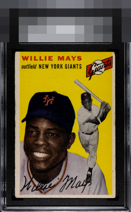
This Mays card displays excellent print registration and vibrant yellow colors that lend it considerable presence. The centering falls short of ideal, yet the piece still delivers high eye appeal, with very little snow and almost no other print defects to interrupt the design. The result is a strong and attractive example of the issue.

Great color but the centering, and corner and surface wear lower the appeal.

Stays in my good B tier as the image and card can be enjoyed without loud flaws distracting me. That said, I could see wanting to improve centering and corner wear a bit.


Good color. Edge wear and some print defects in the yellow background. Off-centered.

nice colors and image but the off centering and the surface wear minimize the full enjoyment potential
EyeQ+
EYEQ+ TROPHY CASE


Rating Distribution
10 total reviews
centering shift, minor tilt on the right, armband print defect and heavy corner wear hurt this one