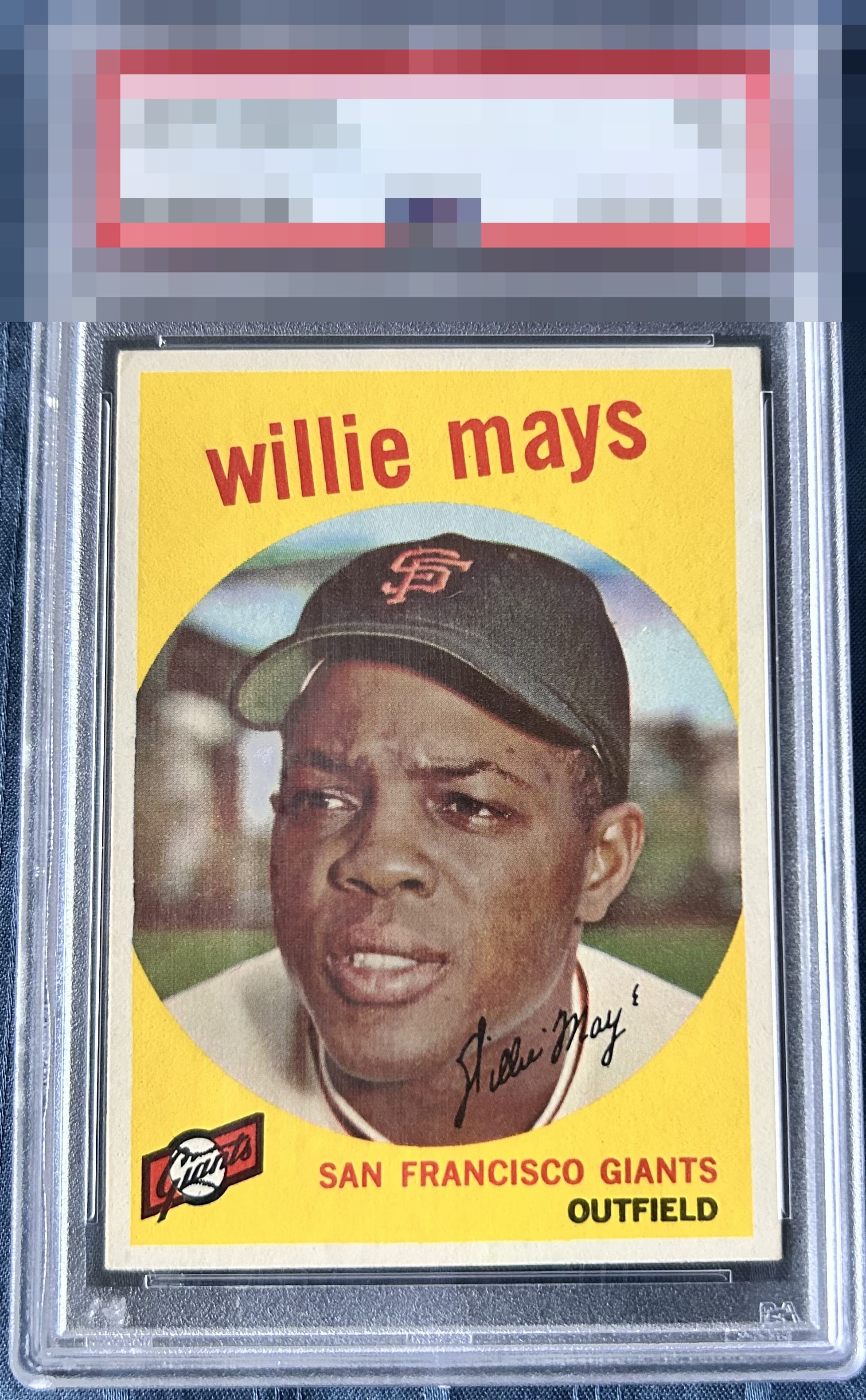
1959 Topps Willie Mays #50

Reviews & Discussions
10 total reviews


Excellent eye appeal for this Mays, highlighted by rich color, strong yellow saturation, consistent surface quality, and attractive centering. The vibrant yellow background really creates exceptional visual presence for me, while the clean overall presentation allows the image to display with freshness and energy. Facial registration is just slightly soft and the top-left corner shows minor wear which holds back from higher grade. Lovely card!


Color and registration look solid to me. Centering is my main note here.

Strong eye appeal with centering and one corner the only aspects I notice.

The upper left corner and the centering are the things that leap out to me. On the flip side, so do the colors and great central image. The yellow really does pop.

Borders make or break a card for me. This card the borders are nice and clean but I do not like the mos-sizing of the borders or the off centering of them. Like how clean and bright they are. Like the nice image and nice clean colors Nice card just held back by the borders

The colors really stand out. The only real issues are the L/R centering and the corner issue on the upper left. Great looking card.
EyeQ+
EYEQ+ TROPHY CASE


Rating Distribution
10 total reviews
Average card. Yellow is nice. Centering could be better and soft corner.