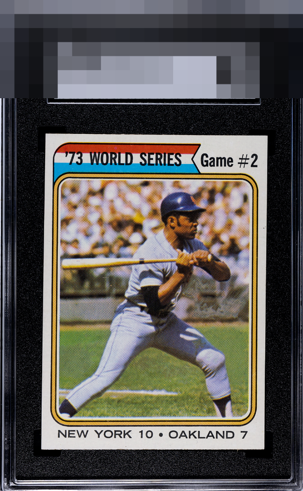
1974 Topps Willie Mays #473

Reviews & Discussions
10 total reviews

Visual authority confirmed. My cycloptic eye is dazzled by this Willie Mays. A blemish in the right border is all that prevents me from bestowing the rare God Tier badge. Well chosen, my human friend!

Only a tiny dot on the right edge holds this back from GT for me. Outstanding copy of Mays' last playing days card!


This is a baseball card. Feels like I am in that moment. Shape of the cut is a hair off but that's a minor concern when all else looks that nice.


Centering is virtually perfect. Colors and image are bold and focused. I assume the reason for the "8" are the corners. Overall, a standout example.

The sole blemish that catches my eye is the spot on the right border. Otherwise a great looking card with colors and image and details that all POP
EyeQ+
EYEQ+ TROPHY CASE


Rating Distribution
10 total reviews
Centering, corners, color, image… all are elite and hard to improve on this example. A beautiful card in all aspects.