1951 Bowman Willie Mays #305
1 / 2
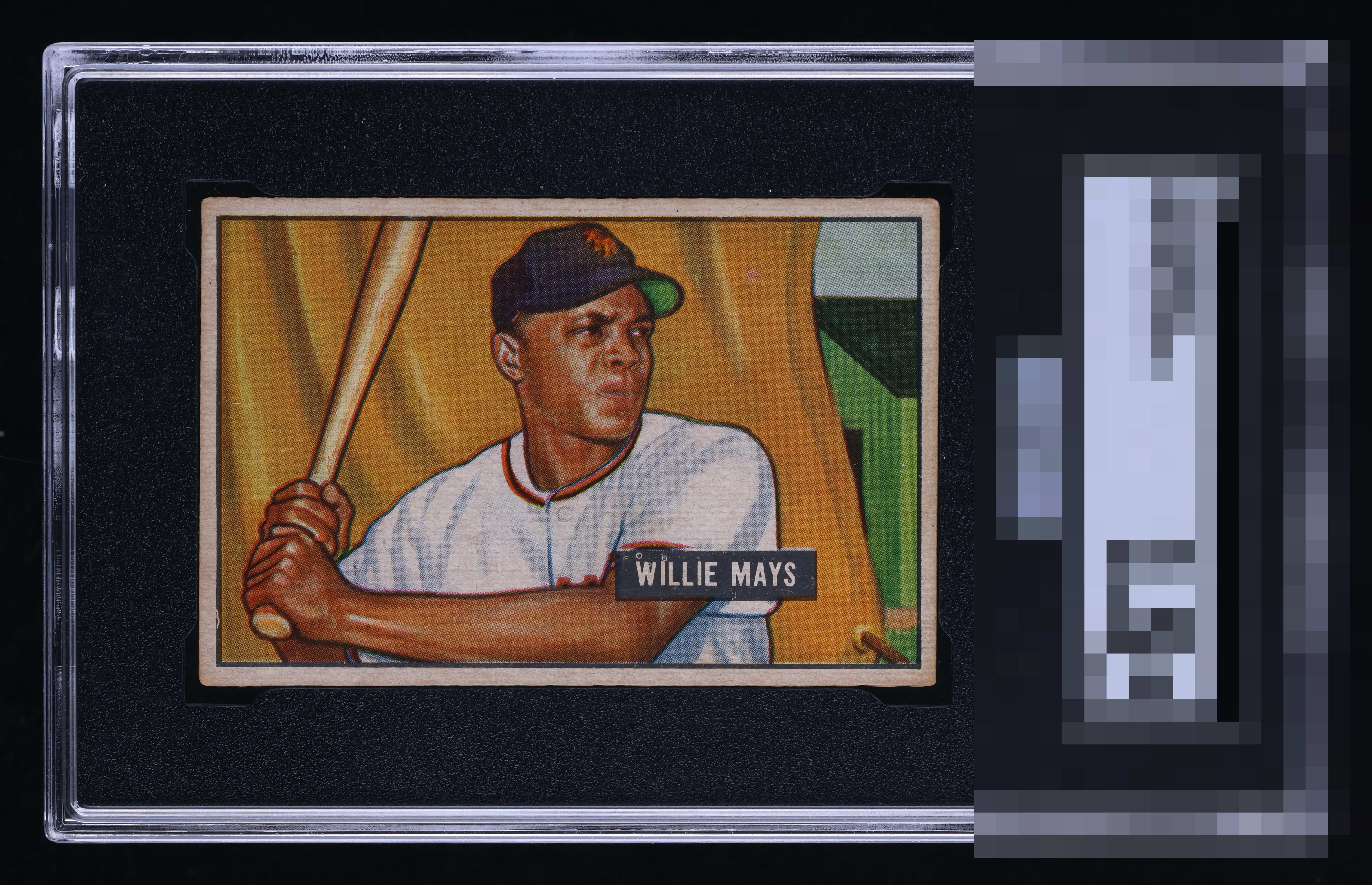
Click to enlarge
💬
Reviews & Discussions
4 total reviews

Really good eye appeal. Centering is at the higher end of most examples, and the image is great with no glaring distractions. Fish eyes in the black nameplate and a subtle registration shift are the only issues that prevent top tier to me.

Well-centered and the colors look very nice. I do notice the purple fisheye up top by the cap and also in the black name box.

image and colors stand tall. The borders are off center, tilted and a bit to toned for my liking.

4 of 7 reviews

0 reviews
EyeQ+
--
Global Population
15
POPULATION ACROSS ALL GRADES AND GRADING COMPANIES
Global Eye Rank
—
No Eye Q+ score
Population in Grade
1
POPULATION IN THIS GRADE ACROSS ALL GRADING COMPANIES
Eye Rank in Grade
—
No Eye Q+ score
EYEQ+ TROPHY CASE

GLOBAL

IN-GRADE
Trophies appear here when earned.
📊
Rating Distribution
4 total reviews
G
0%
A+
0%
A
0%
A-
1 rating
25%
1
B+
2 ratings
50%
2
B
1 rating
25%
1
B-
0%
C+
0%
C
0%
C-
0%
D+
0%
D
0%
D-
0%
F
0%
I am such a sucker for this centering. The fish eyes are noted. I'd still lock it up :)