1951 Bowman Willie Mays #305

Reviews & Discussions
11 total reviews

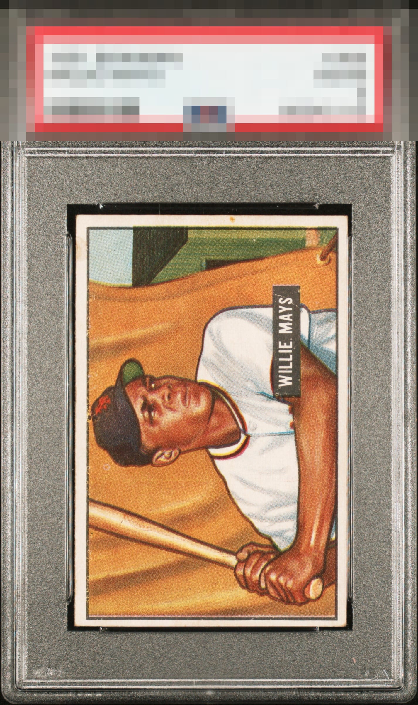
Centering, print issues (most notable at the upper edges of the image near Mays’ head) and some focus issues are the main concerns.

A 51 Bowman Willie is a 51 Bowman Willie. Always a beautiful card that doesn’t leave much for the naysayers. This one has obvious flaws but they work together well enough so that none stick out to knock this off B tier: “beautifully balanced honest wear”

lol I just bid on this one so I know the grade and looked closely at it. Classic low grade high EA. A little OC but still nicely framed. Print spot above the cap but not too noticeable at first glance. Very nice card. Congrats.

Nice image but the centering and surface issues hold this one back. Still presents well.

Some surface and PD. A bit of a registration shift. Good color but not great color. Off-centered L/R.

The strange alchemy of vintage cards is that they can have wear or flaws in truly infinite ways, and each of those ways results in different eye appeal. Here, this Mays carries its wear and flaws well, so much so that the eye appeal remains for me in the second tier. Centering, PD in the top edge and nameplate, a mark in the right side border, and a registration shift add up but the clean central image, corners, and top to bottom centering keep the ship afloat, so to speak.

Card is a respectable mid-tier card with good colors and image. but the stain on the right border, the speckling all along the top border the fisheye to the right of hat all distract and then the centering does not frame the card well
EyeQ+
EYEQ+ TROPHY CASE


Rating Distribution
11 total reviews
Centering and corners aren't the major problems spots for this card. The PDs, stains, and the registration really take away the beauty of this one.