1951 Bowman Willie Mays #305

Reviews & Discussions
12 total reviews


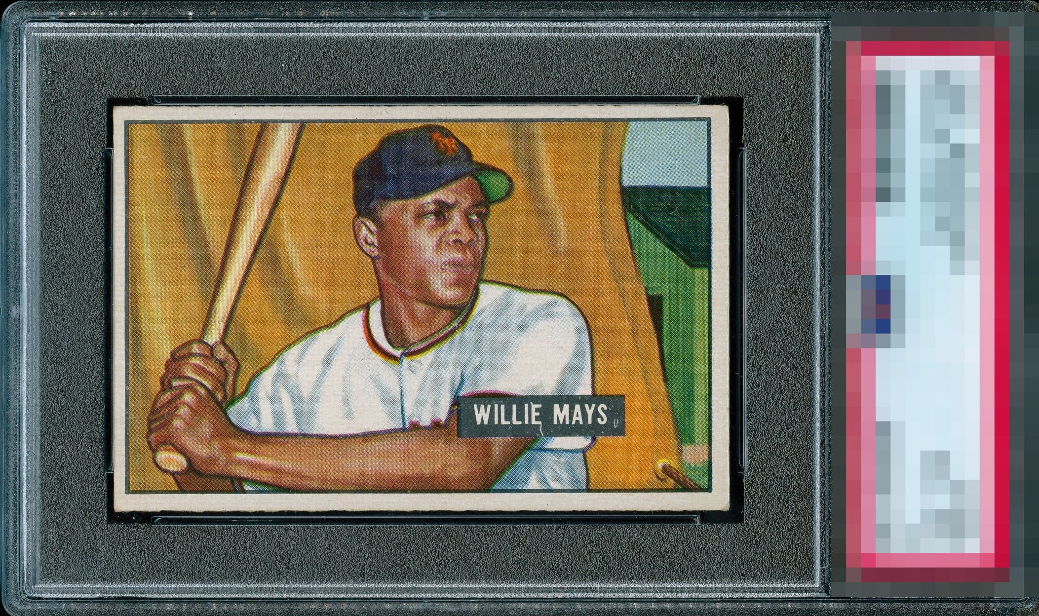
This is a crazy 4. If it was in a 7 holder would anyone think twice? Beautiful card and we don’t even have to be told it’s a superior 4 by adding a gold bar to it!

I'm so used to faint print lines on the 51B Willie, it's nice to see a clean surface. With that said.. Focus seems to be a bit off compared to others; and when combined with less than ideal centering, this card leaves me wanting a bit more.

Centering is slightly off, but I've seen a lot worse on this card. Color looks nice and I don't see any print lines that are common.

Excellent print registration and a clean, uninterrupted border line, a detail that so often falters on this issue. Minor disturbance near the mouth and by the Willie Mays name badge, but nothing that steals focus. Centering is the lone impediment to top honors. As presented, it sits just a breath below an A, with confident color and composure that carry the card beautifully. A fantastic card.


Like the card alot the coloring is sharp and the image is really nice. The borders are nice size but off center and not as bright as I would like. But punches better than the slabbed grade

Beautiful color and registration. Only items to take the grade a little lower is the left to right centering and the mark through the "e" of Willie. Great copy.
EyeQ+
EYEQ+ TROPHY CASE


Rating Distribution
12 total reviews
Textbook B+ eye appeal for me. Very nice in all aspects, yet centering, focus, and some print issues are just visible enough where they knock it from the top top tier of A- and above.