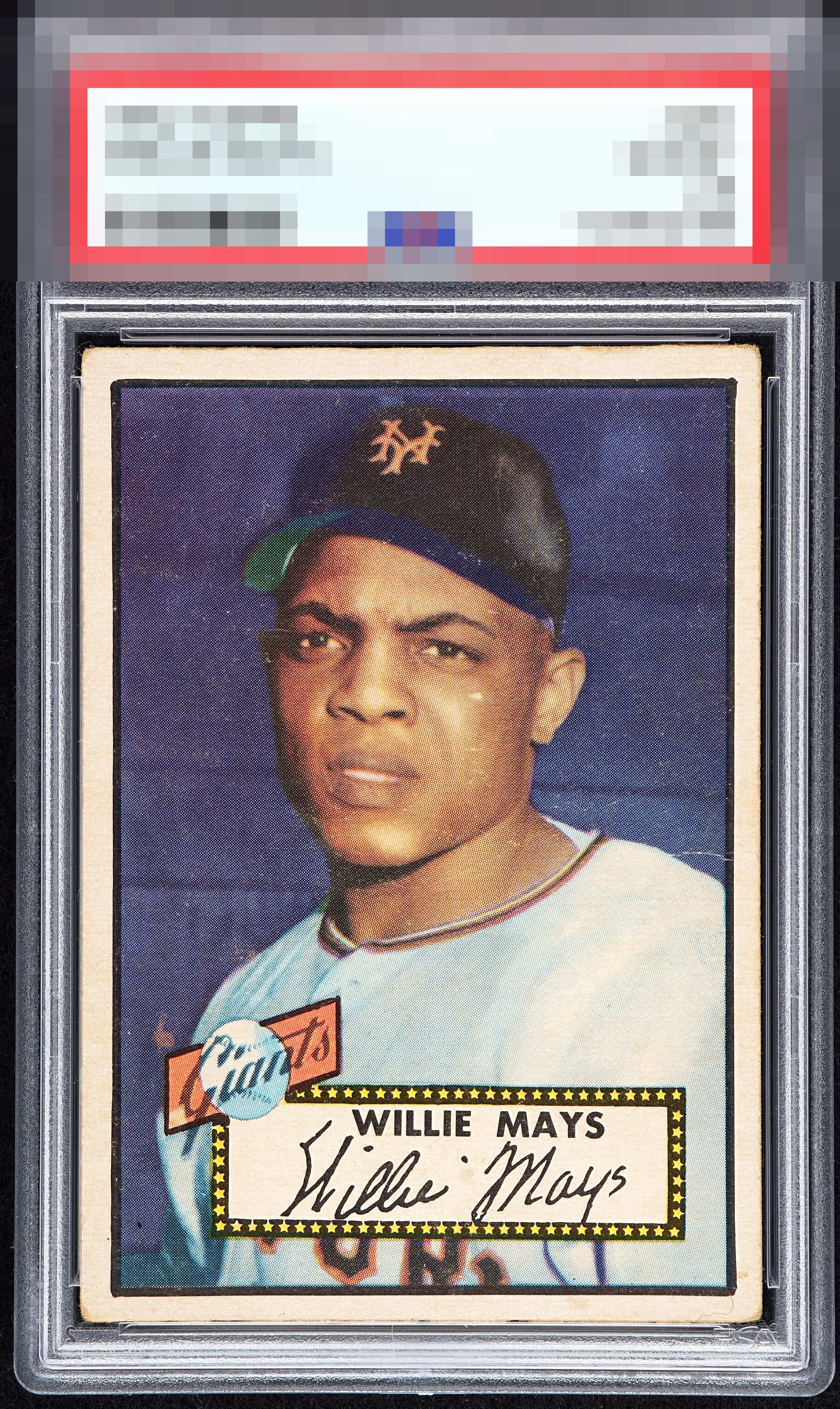
1952 Topps Willie Mays #261
Reviews & Discussions
8 total reviews

Centered too well with too much overall appeal to hit the B tier, but is still off a touch both ways and has enough wear so that A- feels right.


Very good image and nice centering. A few specks around the face and background.

Centering carries this iconic treasure. Some print sport and I've seen a deeper purple but corners are honest and eye appeal remains high. Wish it was mine

I'll take it! Holla at your boy with an invoice! I dig this one. Centering powers eye appeal on the strong side. General corner and surface wear factor in but overall solid.

lot of surface wear affecting the over look of the image and color and the border sizes are nice size and centering is close but still off. bottom corners and borders has some toning
EyeQ+
EYEQ+ TROPHY CASE


Rating Distribution
8 total reviews
Great card with nice centering. Some surface issues.