1952 Topps Willie Mays #261
1 / 2
💬
Reviews & Discussions
5 total reviews

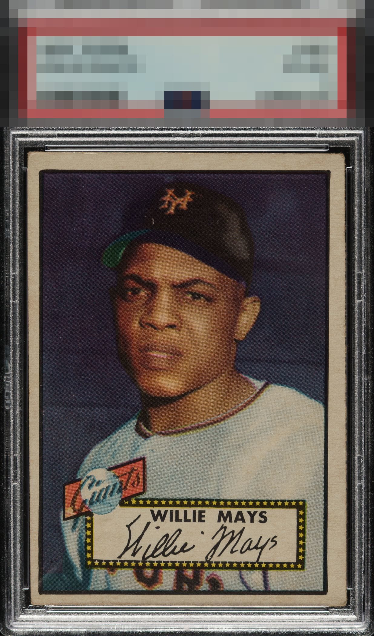
Centering is the lone flaw here, yet it is extreme enough where eye appeal drops to a B for me.

Love the image and color both are strong. Subtle but noticeable surface hurts the eye appeal and the off centering and mis-sized borders holds it back

Centering is the main issue, off both ways with some tilt. Color looks nice but there is some surface wear on the left side and border toning.

5 reviews

0 reviews
EyeQ+
--
Global Population
36
POPULATION ACROSS ALL GRADES AND GRADING COMPANIES
Global Eye Rank
—
No Eye Q+ score
Population in Grade
13
POPULATION IN THIS GRADE ACROSS ALL GRADING COMPANIES
Eye Rank in Grade
—
No Eye Q+ score
EYEQ+ TROPHY CASE

GLOBAL

IN-GRADE
Trophies appear here when earned.
📊
Rating Distribution
5 total reviews
G
0%
A+
0%
A
0%
A-
0%
B+
0%
B
2 ratings
40%
2
B-
2 ratings
40%
2
C+
1 rating
20%
1
C
0%
C-
0%
D+
0%
D
0%
D-
0%
F
0%
Centering is the only major flaw but it certainly draws my eye from an otherwise strong card. Great color and image quality though.