1952 Topps Willie Mays #261
Reviews & Discussions
14 total reviews

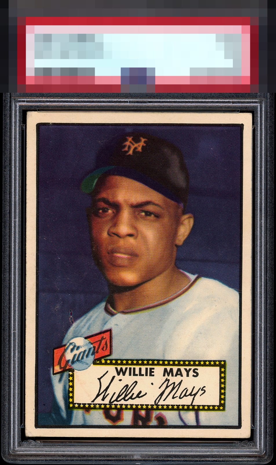
Sensational example as far as centering and borders. Seems to be some serious PD on the left side but it certainly doesn’t pop out at you right away… Everything good about this card pops instead.

Absolutely superlative copy of this 52 Topps Mays that is typically off center left to right. Outstanding example in virtually all respects, from centering, to colors, to registrations to edges. Just a small print defect above his shoulder away from God Tier status in my book.

I understand why the technical grade is a 3, but wow this card pops with vibrant coloring and 60/40 centering for a 73 year old card


The centering on this version is the top .001%. Only being knocked a tiny bit for the surface wear over his shoulder. Beautiful example.


paper damage of some type up the "GIants" it is slightly hidden by the deep background color. The borders are nice and wide but slightly discolored. THe image itself is sharp

This 1952 Topps Willie Mays is an outstanding example. The only notable flaw is some print marking or scuffing near his jersey. Aside from that, the centering is excellent, and the overall eye appeal is very high.

Great card. Unfortunately, the scuffs right off the uniform on the left side hurts the appeal for me. Other than that, it is a very nice card.
EyeQ+
EYEQ+ TROPHY CASE


Rating Distribution
14 total reviews
A+ Color B+ Registration A Cut / Centering (back kept it from A+) note: all 52T Mays cards have a slight slanted right thin line black border unless it’s miscut.