1953 Topps Willie Mays #244

Reviews & Discussions
10 total reviews

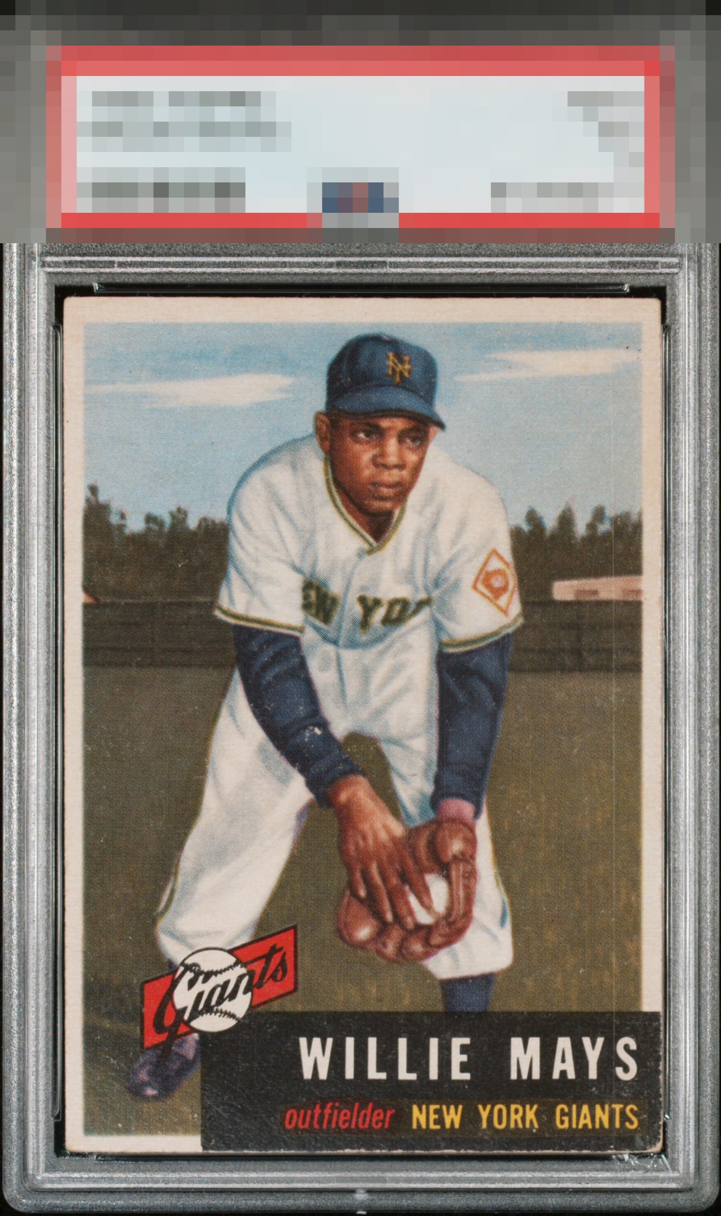
Centering is elite. Image quality is solid, Corners are worn but are not a major issue for this collector.

This card is getting this grade on vibes. It's well centered with perfect registration. Most of the problems are away from that awesome image of Mays. For some reason, I'm not getting caught up in the flaws.


Centering isn't perfect but better than most. The print line on the right and corner and edge wear around rhe black box keep this at B tier for me.

Some surface wear and the vertical line on the right stands out. Good image but colors don't pop.

nice looking card with well sized borders and centering. the surface wear in the background as well as the black box issues at the bottom hold it back

Top Tier eye appeal; I would buy this copy and not look back. Love the centering. The delicate black area's wear does not set off my alarm.
EyeQ+
EYEQ+ TROPHY CASE


Rating Distribution
10 total reviews
Nice example of the '53 Mays! Deep color, sharp registration and ideal centering carry the day here. Holding it back from a higher score are surface distractions, particularly on the sleeve. And the lower right corner appears weaker, noticeable because it is in the nameplate. Overall great card!