1953 Topps Willie Mays #244
Reviews & Discussions
13 total reviews

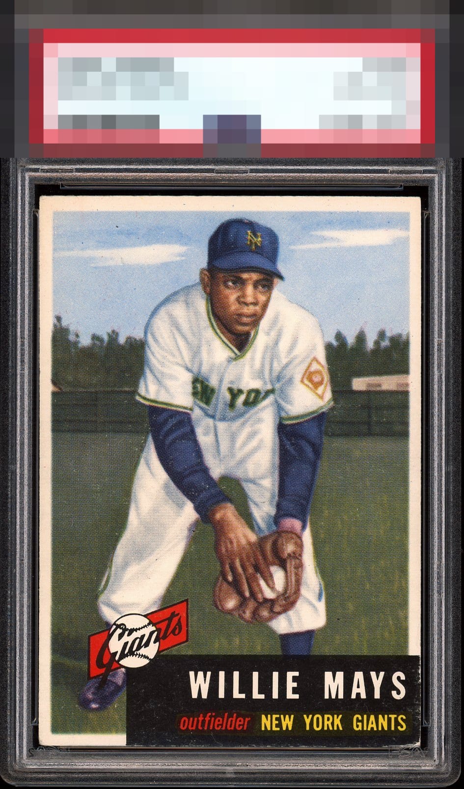
Presents well. Back side of the card is where you notice the blemishes but all in all the owner of this card did a remarkable job of selecting a great example of this card

Solid centering and clear registration. A lot going on in the infamous bottom right corner, but it doesn't take too much away from this one.


incredible version of the card, the only items knocking it is the bottom right corner and the top to bottom centering. Banger!

Love the side centering and the image has nothing detracting from it. The sky and background of the 53T Mays always charms me. Sits a click low and the pesky colored corner that is every 53T's Achilles concedes some wear that the eye catches.


Overall, the card boasts good print registration and vibrant colors with excellent contrast, especially around the areas of his glove, hand, and face. However, achieving a top-tier grade for the black areas is challenging, and there is noticeable wear on the lower right corner. The centering, while good, doesn't quite reach that top-tier or A level.

Bottom right corner and centering adjustment top to bottom keep from a higher grade. Otherwise, nice version that is easy on the eyes.
EyeQ+
EYEQ+ TROPHY CASE


Rating Distribution
13 total reviews
A+ Color A+ Registration A- Cut / Centering (lower card’s (our) right corner and back paper loss kept it from A+)