1960 Topps Willie Mays #200

Reviews & Discussions
12 total reviews

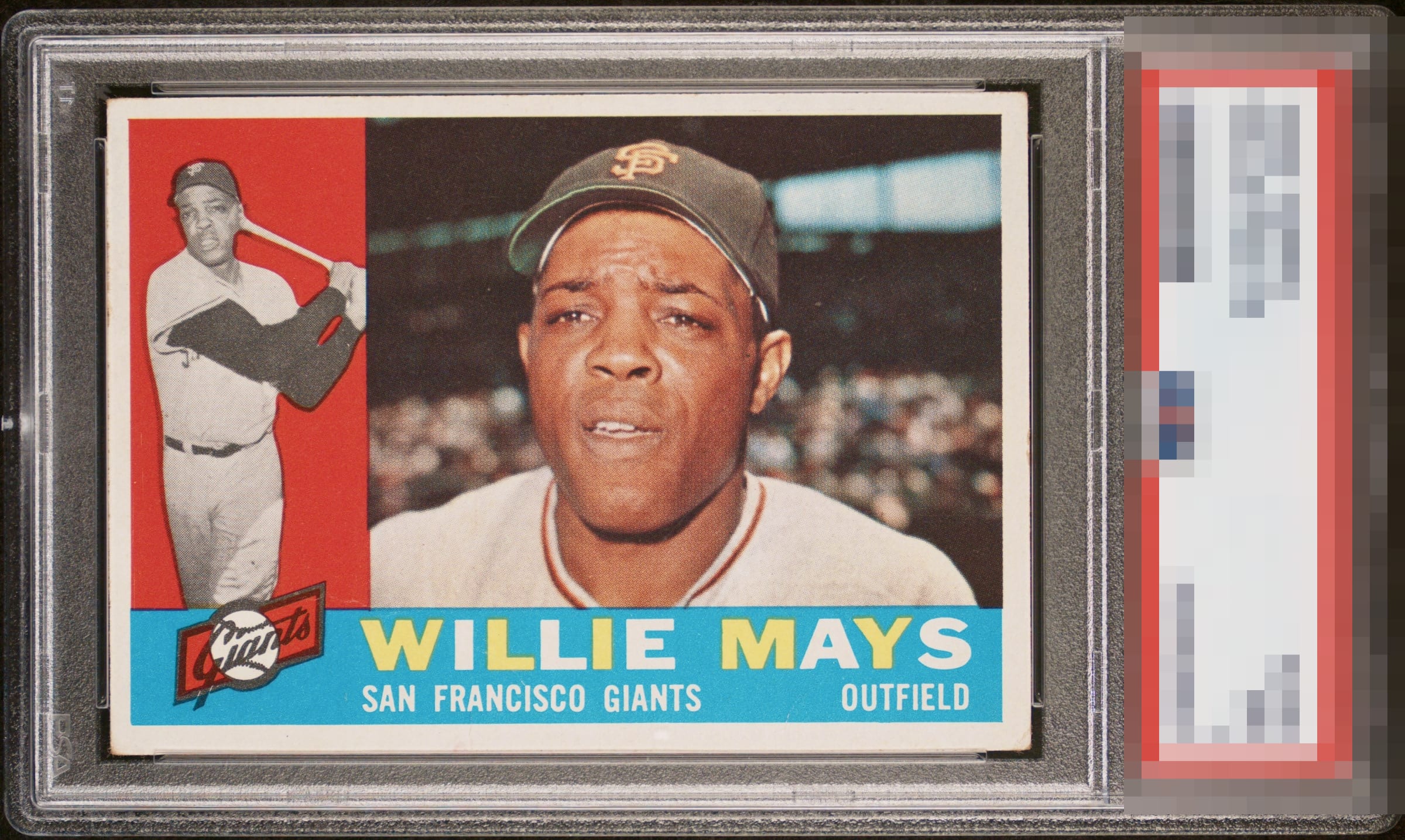
Visual authority confirmed. Flawless red and blue regions. Near-perfect centering. Well chosen, my human friend.

There are a lot of Mays #200 cards out there with bad registration and PDs. This is not one of them.

This is a very tough and condition sensitive card - but you wouldn’t know it from looking at this one at first glance. A prototypical 60 Mays that punches far and above its weight class!


The colors and crisp image carry this copy to almost the top. Just a touch better centering and this would be GT for me all day.

The pristine quality of the red and blue print plus the registration and focus more than offset 1mm of side to side centering in my book. Beauty.

Outrageously nice eye appeal with bright and vivid colors. Great card!

Amazing clarity on the card that the details on his face is so clear Overall a really nice look

This is one of the coolest freak cards I have seen here. Talk about serendipitously placed wear.
EyeQ+

EYEQ+ TROPHY CASE


Rating Distribution
12 total reviews
Very clean card with great color. Centering is slightly off but better than most.