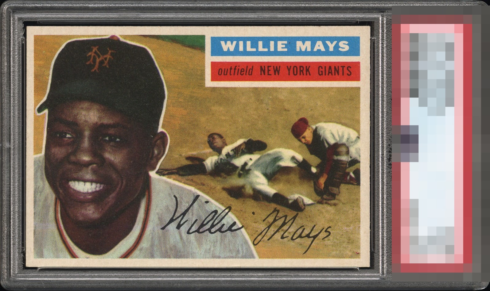
1956 Topps Willie Mays #130

Reviews & Discussions
12 total reviews

Fantastic looking example. I'm a sucker for perfect centering so it's easy for me to see the only flaw here.. Takes hardly anything away from the copy, which is otherwise stunning.


The focus is razor sharp and colors absolutely pop! If it was centered it would reach GT. She's a beaut!

Centering is slightly off left to right, but close enough for me. Everything else on the card looks amazing. Very nice example.

Side centering is the only small eye appeal flaw here. High 'A.' For my eye, a gentle touch of corner wear with perfect centering and this is GT.


Really like the look of this card. Centering opportunity but with it being a horizontal card it is not as noticeable. The image and the colors are strong. And to me the Details of the photo really POP out. Wish the borders were brighter but this is a card I would be proud to have

Near complete satisfaction in the eye appeal dept. Side centering to the left is the only thing that I notice.

What a great action image that really grabs your eye in the best way. Crisp card. Side centering for me keeps it at the extremely high A+ level. Looks better than lots of higher TPG examples.
EyeQ+
EYEQ+ TROPHY CASE


Rating Distribution
12 total reviews
A "click" to the right on centering and this is easily GT.