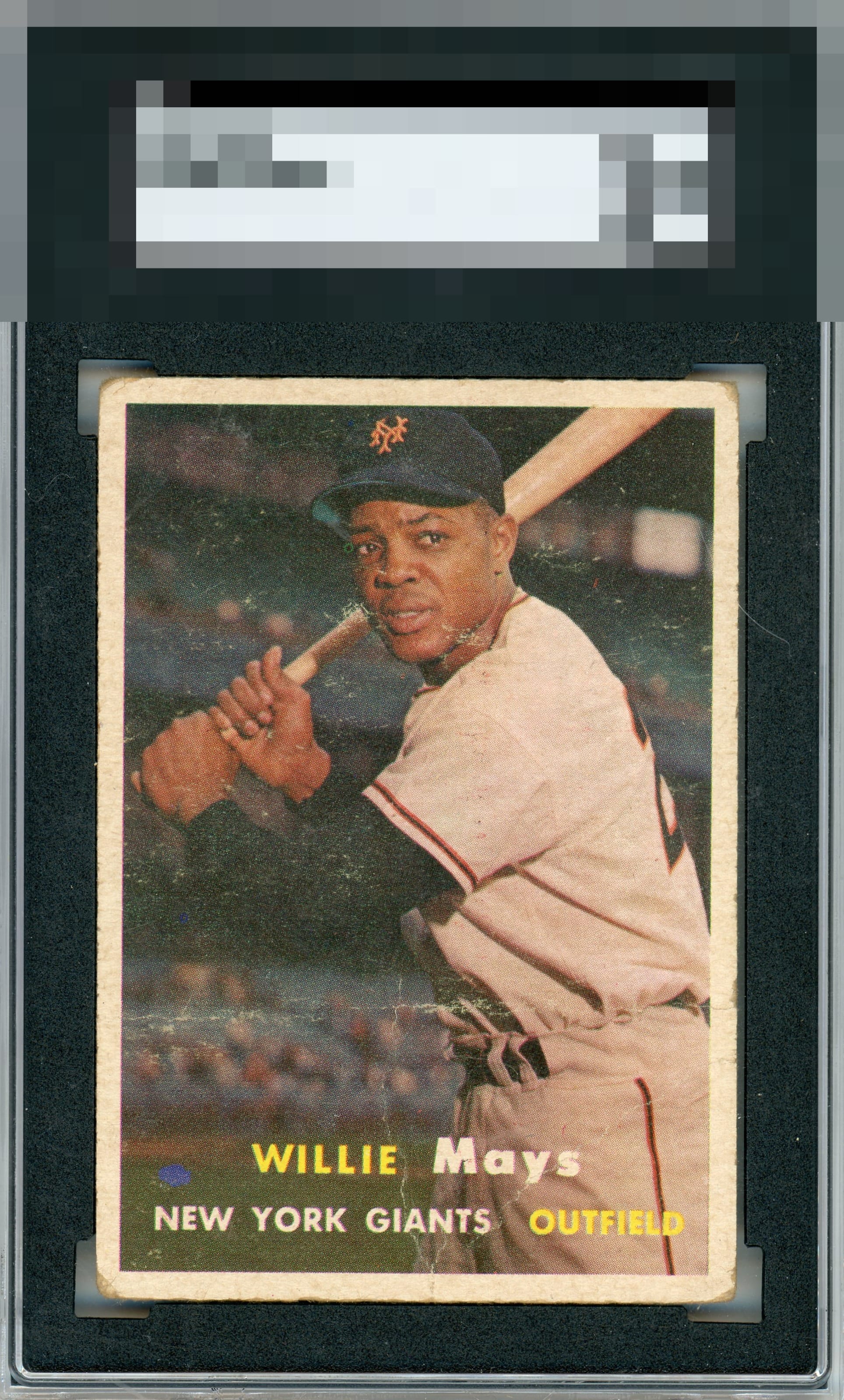
1957 Topps Willie Mays #10
Reviews & Discussions
9 total reviews

Centering and a still enjoyable image keep the eye appeal in the average tier to me. Surface is obvioously the big issue.

The centering is solid. The creases are in an ideal place. The biggest issue is the print and surface issues around the face. Anywhere else and this goes up a few notches for sure.

Centering is good and keeps this just above D tier, but the surface has a lot of issues. Corners are more rounded than I'd prefer as well.

Stays in the third tier thanks to lots of uniform wear; it remains a well-framed viewable image of Mays, as opposed to there being one glaring issue that mars his face or that my eye sticks to.

you can see and enjoy the image but sadly to much surface wear and creases and corner damage for my liking

EyeQ+
EYEQ+ TROPHY CASE

Rating Distribution
9 total reviews
This presents quite rough to my eye. Creases and edge wear both hurt.