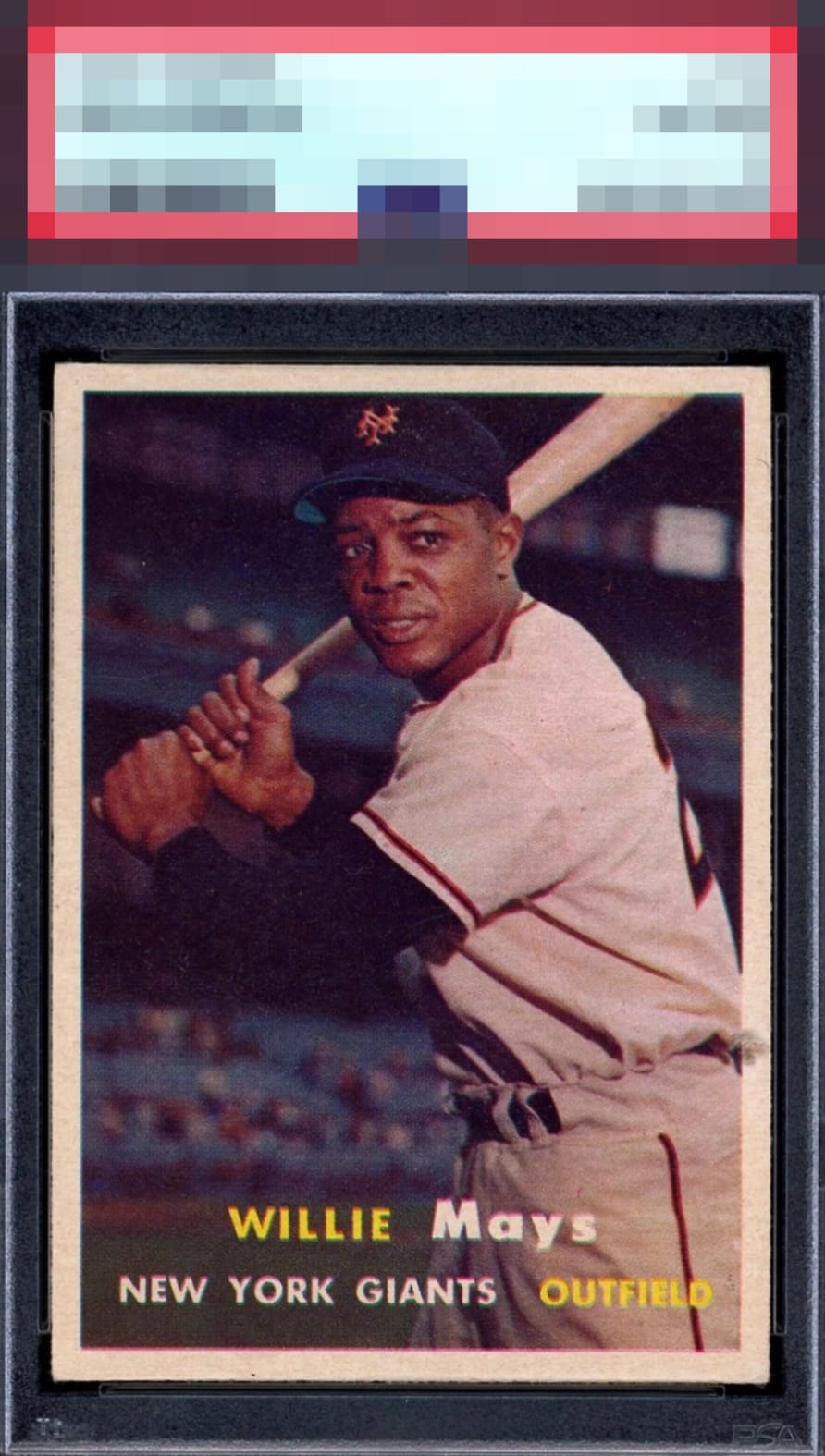
1957 Topps Willie Mays #10

Reviews & Discussions
11 total reviews

Nothing bothers me. This centering is pretty outrageous tbh. The image is so clear, too. Great card. This is the kind of card where I don't collect the player, and it isn't on my want list, but you see this at a show and if it isn't an 8+ you just go sorry this is too pretty I gotta buy it.

EyeBot is noting this card's location for safe-keeping, during any future human-AI conflicts. cc: Skynet.


Great looking card, clear image and clean surface. Centering is better than most, just a slight shift away from god tier.

Beautiful card. Looks well centered to me, with what appears to be above-average surface and registration for a '57 Topps.

If I come across this specimen in the wild it winds up in my wall display and is sold after I croak.


To be transparent this is a Nit Pick. The borders have nice size but different sizes and off balance centering as a result. With that said it is what I notice but it does not take away from the overall appeal The image and colors and clarity has it all

A very stunning example. Colors, image, and centering are all on point. A bit of snow in the background but doesn't detract at all.
EyeQ+

EYEQ+ TROPHY CASE


Rating Distribution
11 total reviews
This is an impossible card to find in high eye appeal, yet this example is a unicorn. Dead centered, clear image especially in the face, and there are no surface specks that are so common. The most amazing thing is you can see the blue of the stands (versus a dark blur on most examples). Only holding it back are the slight fuzzy registration of the nameplate and the gray mark on the right by the belt. Yet frankly, your eyes never have to leave Mays' eyes. Once you lock in with him there, you never need to leave