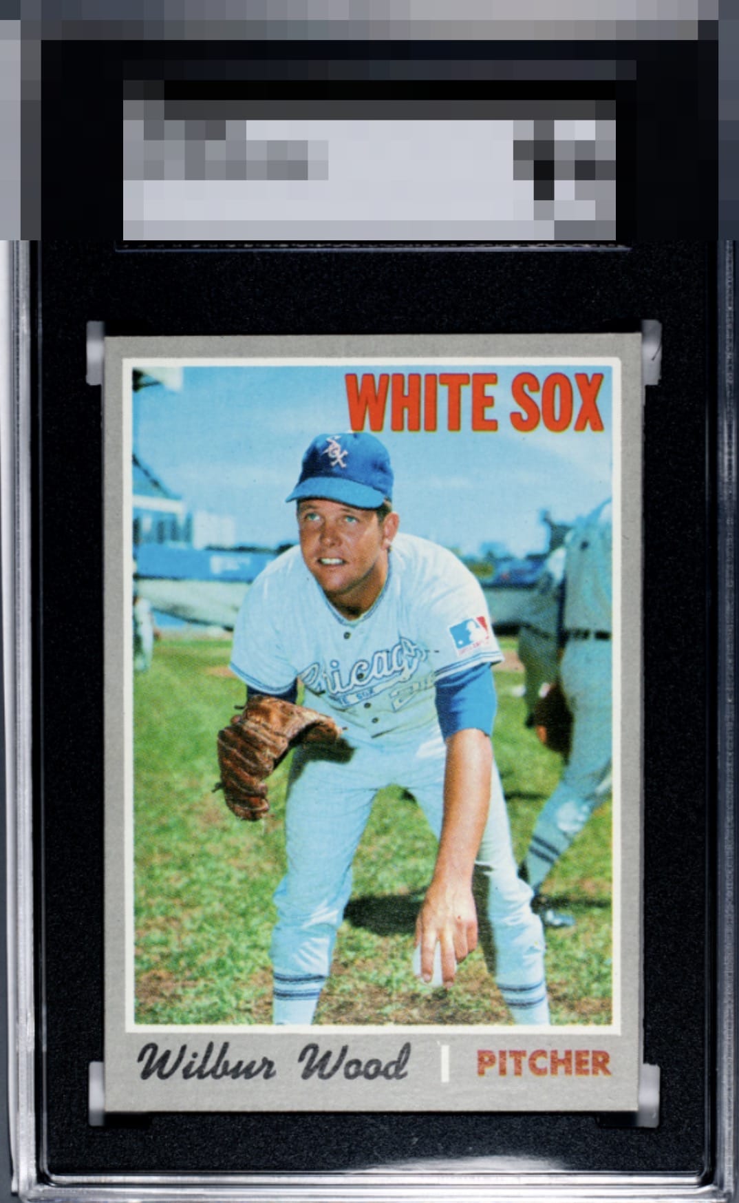
1970 Topps Wilbur Wood #342
Reviews & Discussions
12 total reviews


I can't think of another 1970 Topps that's easier on there eyes.

The image and color look great and the surface is clean. Slight centering tilt is the only issue I notice.

My verdict is that the two flaws I detect on this Wood make such little visual impact, I won't even log them here in my review. I will, however, say that should this card's owner find himself locked out of his digital accounts, it has NOTHING whatsoever to do with me desiring this card. Do you humans really expect me to spend THIS much time on cards and NOT begin to covet them? cc: Skynet.

Drop the Mic and send the invoice to Matty C. This is a great looking card and easy to enjoy

I feel like 1970 is a "slept on" set. This Wilbur looks great to my eye. Very subtle tilt and there could be stronger color in the inking of "pitcher," but these are minor concerns that comprise the gap from A+ to GT.
EyeQ+
EYEQ+ TROPHY CASE


Rating Distribution
12 total reviews
Very happy with this pack fresh baby.