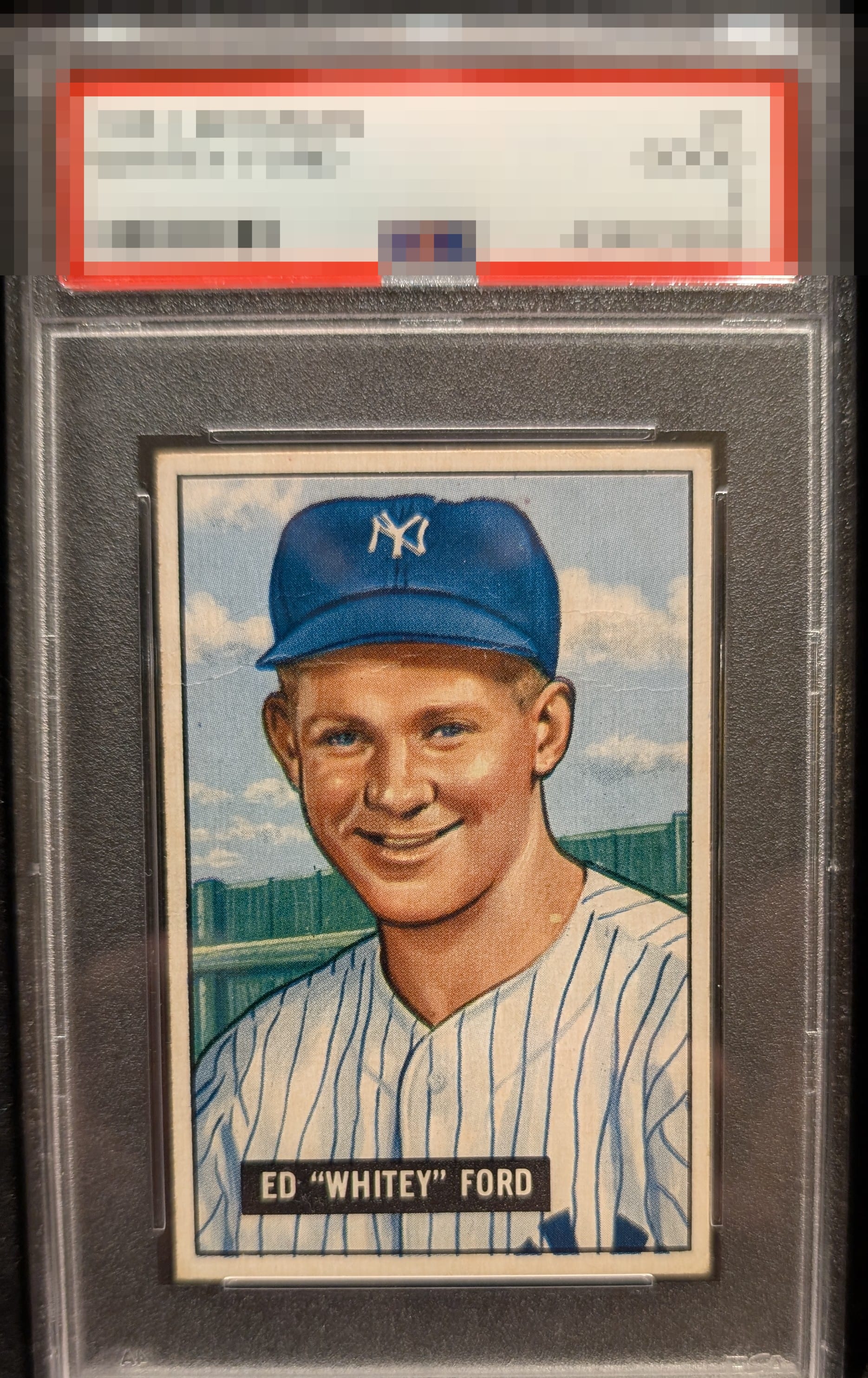
1951 Bowman Whitey Ford #1

Reviews & Discussions
10 total reviews

Some slight OC within the card but holds nicely with everything else.

Centering carries this card for sure. The crease does not jump off the page but is slightly noticeable on first look which keeps this card in the B range.

GT centering and with the way I collect, those corners are totally fine. The crease is the obvious issue and it will be interesting to see how it affects each of our eyes. For me, it detracts but it's not enough to leave the top tier of eye appeal. Well placed and subtle. Mark on his neck actually draws my eye a little more. But when I reset my eyes and step back, as my friend says, the eye appeal hits.

Great color, registration, and centering. The creases can't be ignored, but they're overwhelmed by the rest of the card.

Amazing card and why Eye Appeal Inc is needed. Slab does not do it justice. Great looking card, nice centering, colors and image are solid

Very well-centered with nice colors. Horizontal crease under the brim of the cap. Not distracting but it's there. The card presents very well.

This is one of those freak unicorns where there's a wrinkle yet it is hardly noticeable to the human eye in an everyday viewing environment. The centering is God Tier and the registration is almost pinpoint. I would buy this in a heartbeat.
EyeQ+
EYEQ+ TROPHY CASE


Rating Distribution
10 total reviews
Great centering, borders and borders are fine. The crease and PD catch my eye enough to hold it back from the highest tier. Still a very presentable card that I’m guessing punches well above its numerical grade.