1953 Bowman Warren Spahn #99

Reviews & Discussions
7 total reviews


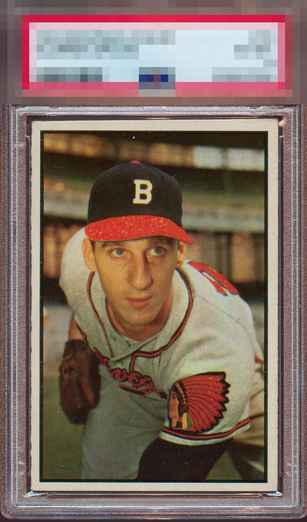
What an interesting case this card presents. That cluster of fish eyes on the bill of the cap is not something I have seen before. The rest of the card is rather strong, with B+ centering. Ultimately the print issue makes a big impact on eye appeal yet some of that lost ground is reclaimed by the rest of the card.

Fish eyes throughout the red inks really holds this one back, unfortunately.

Shame the fish eyes on the cap and the speckling in the background really hold back the card. The centering is off but it still frames the card well (optical illusion on how he is tilted vs the card) and the main image is not negatively impacted

The many fisheyes on the bill of the cap is what I instantly see. I'm giving it a low rating because it does make me uncomfortable when I look at it as it's very distracting.
EyeQ+
EYEQ+ TROPHY CASE


Rating Distribution
7 total reviews
Only minor edge defects hold this beauty back