1948 Leaf Warren Spahn #32

Reviews & Discussions
13 total reviews

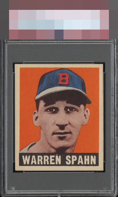
For a 1948 Leaf, a set notorious for chronic centering woes, this example defies the odds with near-perfect alignment. Print registration is sharp and free of the common “3D” shadowing that plagues many from the run. Aside from a small blemish above the “N,” it presents as a strong, high-eye-appeal example worthy of the A tier.

Incredible centering for a 1948 Leaf card — though, to be a perfectionist, it’s just slightly off. The registration, however, is A+

Very nice copy at first sight. Shifted to the right a touch, with an additional tilt. Characteristics within the borders are top notch

Diamond cut/out of square and upward centering shift hurt an otherwise beautiful copy for me.


Fantastic centering for a card this is typically off severely left to right. Overall, great color and the wrinkle running across the back is very minor when taking the entire package into account! Solid A for eye appeal.

Sharp corners. Smalls spots on the border at bottom left and wear on the upper edges. But the centering, the coloring, the overall appeal is strong.

I'll put my decades of card passion up against whoever graded this all day. Oh, back wrinkle, what a blessing you are to the collector! What can I type that any human's eyes looking at this card cannot tell in a nano second? This is a bullseye card in terms of how pleasantly it his the eye, if ever there was one. Then, after noting that, one can look above it at the old system's opinion sticker and see that the "technical" grade and any human's eye appeal assessment simply do not match up. That lack of harmony is why it helps to write a review like this and convey the fuller picture and story.
EyeQ+
EYEQ+ TROPHY CASE


Rating Distribution
13 total reviews
Beautiful color and registration. Only the clockwise tilt keeps it from the A band for me.