1983 Topps Wade Boggs #498
1 / 2
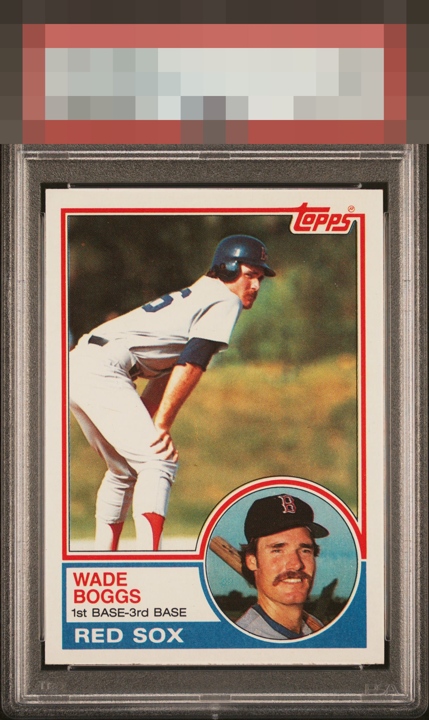
Click to enlarge
💬
Reviews & Discussions
10 total reviews

Centering is just a little off, but overall very good eye appeal.

Centering and bottom edge are the hold backs here. Otherwise beautiful copy.


colors seem muted and the centering could be better but the image and color and clarity make it a nice card to enjoy
Locked
3 reviews
EyeQ+
97.0
Global Population
3
POPULATION ACROSS ALL GRADES AND GRADING COMPANIES
Global Eye Rank
#2
Population in Grade
1
POPULATION IN THIS GRADE ACROSS ALL GRADING COMPANIES
Eye Rank in Grade
#1
EYEQ+ TROPHY CASE
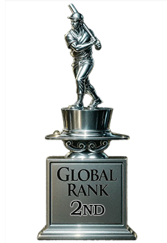
2nd Place
GLOBAL
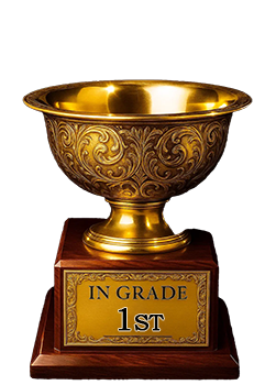
1st Place
IN-GRADE
📊
Rating Distribution
10 total reviews
G
0%
A+
0%
A
3 ratings
43%
3
A-
2 ratings
29%
2
B+
1 rating
14%
1
B
1 rating
14%
1
B-
0%
C+
0%
C
0%
C-
0%
D+
0%
D
0%
D-
0%
F
0%
Shift is noted but very nice example to enjoy.