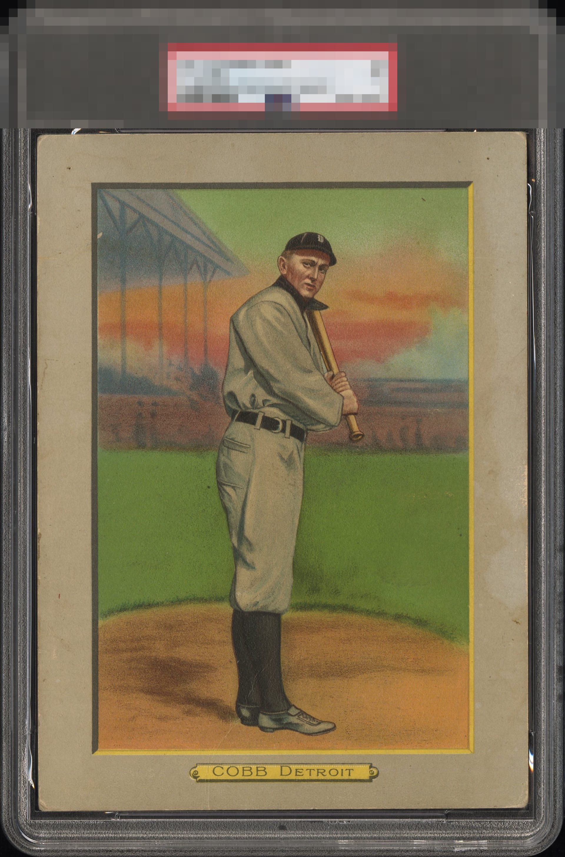
1911 Turkey Red Ty Cobb #9

Reviews & Discussions
11 total reviews


I'm predicting a high EyeQ for this one as there's obvious wear but it really does not wreck the party.

The "frame" is showing its age but I really don't care. The image itself is beautiful, BUT there's a crease and some paper. Too cool to drop out of the 'A' zone.

While there’s some visible wear, anyone would be proud to dispay this piece like a work of art.

My eye spots the crease and staining of the boarders. It also is drawn immediately to the strong, well framed central image in this oversized issue. Certainly above average eye appeal

Very cool piece, more like a work of art than a baseball card. The image looks great, but surface wear and what appears to be either paper loss or staining on the right side of the border keeps this at a B tier for me. Still presents well.

The image and colors look great. Some soiling around the borders but generally doesn't affect the eye-appeal too much.

Really like the look of the card and this series of cards has some of the nicest graphics. The colors and image are solid. The borders are nice sized and frame the image well. The border has staining/discoloration which blends in but does hold it back from the A Tier

Overall a piece that wears its wear well, and in the right places. Very good eye appeal to me as the big central image has no distractions within it; a small wrinkle through his feet does not factor in to me. The signs of age (corner wear, edge wear, staining in right border) are contained in the border, and while they make an impact on eye appeal, it's to a small degree as they don't scream out at me. The back is fine to me as I can read everything.
EyeQ+

EYEQ+ TROPHY CASE


Rating Distribution
11 total reviews
My cycloptic sensor determines the flaws on this Cobb are such that they do not severely affect visual appeal.