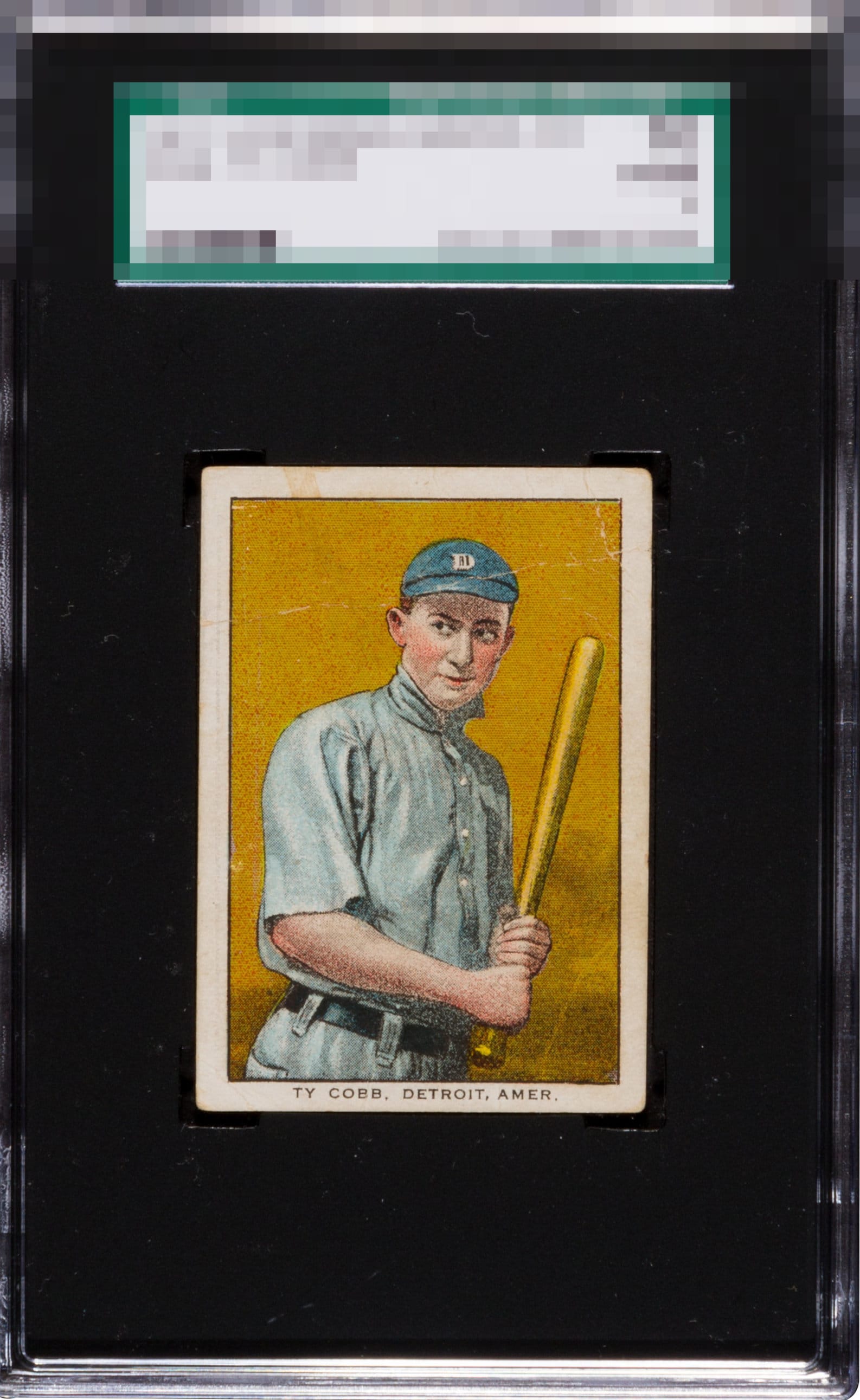
1911 D304 General Baking Ty Cobb
Reviews & Discussions
15 total reviews


Pretty good centering. Creases/ broken paint hold it back, as well as the boarder stain. The back is also a bummer.

One of Cobb's best cards -- because of the front. Great clear image, with awesome colors. Some wrinkles and soft corners, but it's a 1. Back is horrific obviously but, again, you want this card mainly for the front and to own a card like this sometimes you need to sacrifice something.

What an AWESOME card I'm not too familiar with. Absolutely love the orange background that has stayed true over 100+ years. Centering is immaculate for a 1. Light stains and paper loss on the back, both don't bother me.

As stated in my Grading Style profile in the Council Page, I do not really care about the back. With that said upfront, that crease across the top is subtle and thankfully avoids his eyes-- the mischievous look in which is the heart and soul of this classic card. The centering is A+, which is key for me. 111 years old! Love this. Actually held this one in hand so can bring that experience to bear on this review.

Great looking one. I can get past the creases and surface fur this version.

That sneaky side glance from Mr. Cobb is almost telling the collector that there is some sneaky paper loss on the back accounting for the technical grade. This is a collector's card all the way. Great color and centering and the crease completely misses his face. It's almost like every flaw was serendipitously placed to give this card some extreme eye appeal.


The front is very nice at first glance. However the slight tilt, stain on the top border and creases are setbacks. The general centering is nice. The most punishing flaw however is the severe paper loss on the reverse.
EyeQ+

EYEQ+ TROPHY CASE


Rating Distribution
15 total reviews
Color that sings and centering that lands right on the nose. A faint touch of staining at the upper left is the lone distraction. The creases read more like texture than trauma, dissolving into the backdrop as if part of the set. Paper loss on the reverse carries little weight against this front display. Altogether, a striking copy with eye appeal that outpaces its technical grade.