1939 Play Ball Ted Williams #92

Reviews & Discussions
10 total reviews

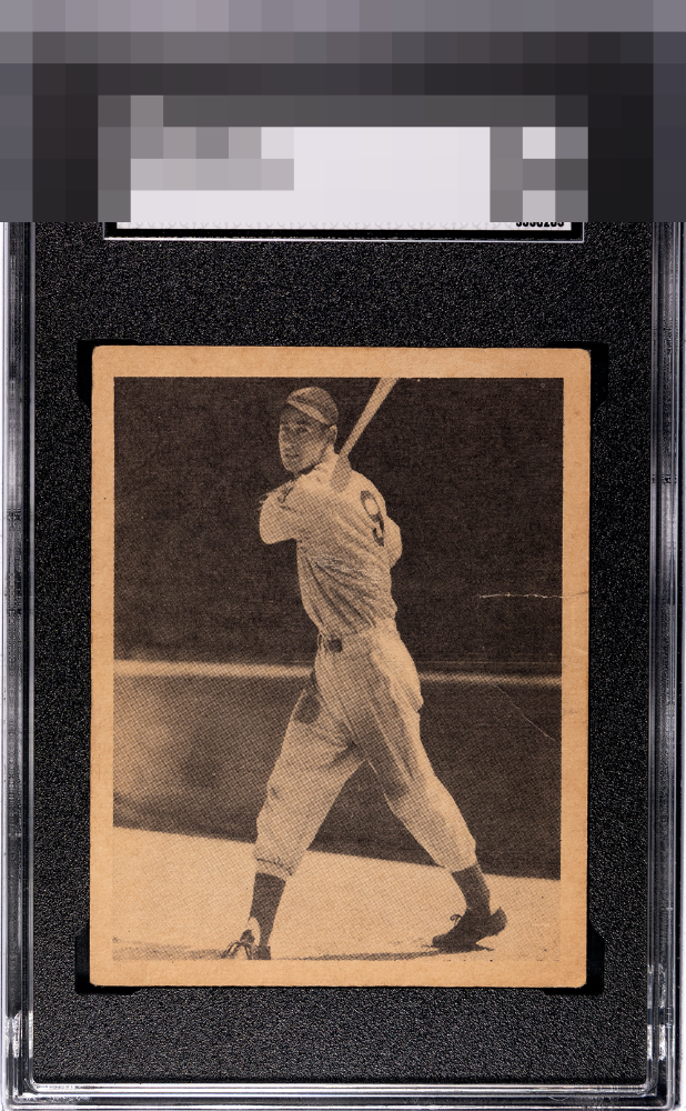
The toning holds it back but the print quality & framing is excellent.

Combination of fairly strong toning, corners, centering and creases hit the eye pretty good on this one.

Some centering issues and the crease draw my eye but that crease is well placed to keep the overall eye appeal strong for me.

The image is clear and looks good. Centering is not bad but off left to right with a slight tilt. The crease on the right and border toning are the main issues.

Centering and what looks like a half baseball diamond crease catches my eye. Still a nice card.

This is a great example of flaws being present but not really screaming at me for attention. The image holds my eye and the centering is in my strike zone.


What a 1. This is going to have some EyeQ+ when the dust setlles.

All about the discoloration or aging of the card. That is what stands out but the card has nice borders and the image is still sharp

EyeQ+

EYEQ+ TROPHY CASE


Rating Distribution
10 total reviews
too much time working on your tan Ted!