1948 Leaf Ted Williams #76

Reviews & Discussions
14 total reviews

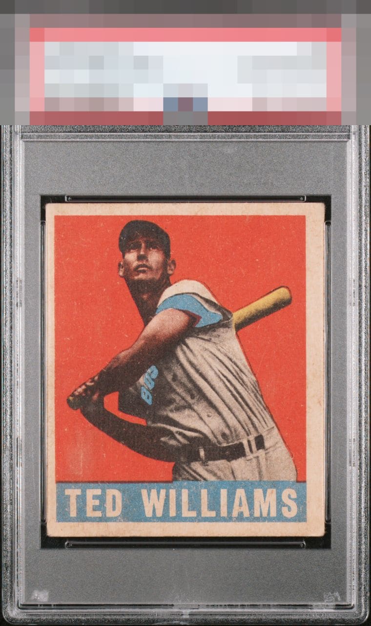
Good registration for Leaf and warm softer color that is mostly consistent. Centering to the left and aged surface feel hold it back.

If only you could go back in time and tap this card's sheet before it went through the cutter...

TThis card is held back by the obvious centering, surface and print ssues.

Centering and surface catch the eye quickly in OL Teddy Ballgame in this one.

Nice registration but pushed left & color is pretty faded. I don’t mind a little back damage but this one has a little too much.


Centering is the first issue that jumps out for me. I notice what looks like some surface imperfections and fading as well. I'd still have no problem staring at this for hours.

Centering dampens the eye appeal with surface snow a milder consideration.

First thing I see is the surface wear on the card below the bat and above the “Ted” and it distracts me and affects both the quality of the image and the colors. Add to the off centering and I would pause on the card. The overall image and the colors above that spot are respectable
EyeQ+
EYEQ+ TROPHY CASE


Rating Distribution
14 total reviews
Good second tier eye appeal as Ted's image is free of any distractions. The centering and a faded look to his name area are aspects that dampen eye appeal.