1956 Topps Ted Williams #5
1 / 2

Click to enlarge

💬
Reviews & Discussions
8 total reviews

This card has a little bit of everything that makes a card beautiful


really nice card but the centering and border sizes hold it back for me. The image and the colors are easy on my eyes

Centering makes an impact on what is otherwise a thoroughly pleasing example to the eye, save a mild touch of wear along the top border. Solid Ted.
Locked
1 review
EyeQ+
127.0
Global Population
8
POPULATION ACROSS ALL GRADES AND GRADING COMPANIES
Global Eye Rank
#4
Population in Grade
3
POPULATION IN THIS GRADE ACROSS ALL GRADING COMPANIES
Eye Rank in Grade
#2
EYEQ+ TROPHY CASE
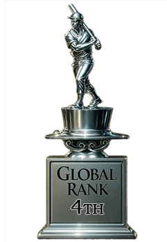
4th Place
GLOBAL

2nd Place
IN-GRADE
📊
Rating Distribution
8 total reviews
G
0%
A+
0%
A
0%
A-
2 ratings
29%
2
B+
3 ratings
43%
3
B
2 ratings
29%
2
B-
0%
C+
0%
C
0%
C-
0%
D+
0%
D
0%
D-
0%
F
0%
As a centering guy, this degree of centering prevents the A Level but the rest of the card is totally pleasing and so we have very good eye appeal aka B+.