1958 Topps Ted Williams #485
Reviews & Discussions
8 total reviews


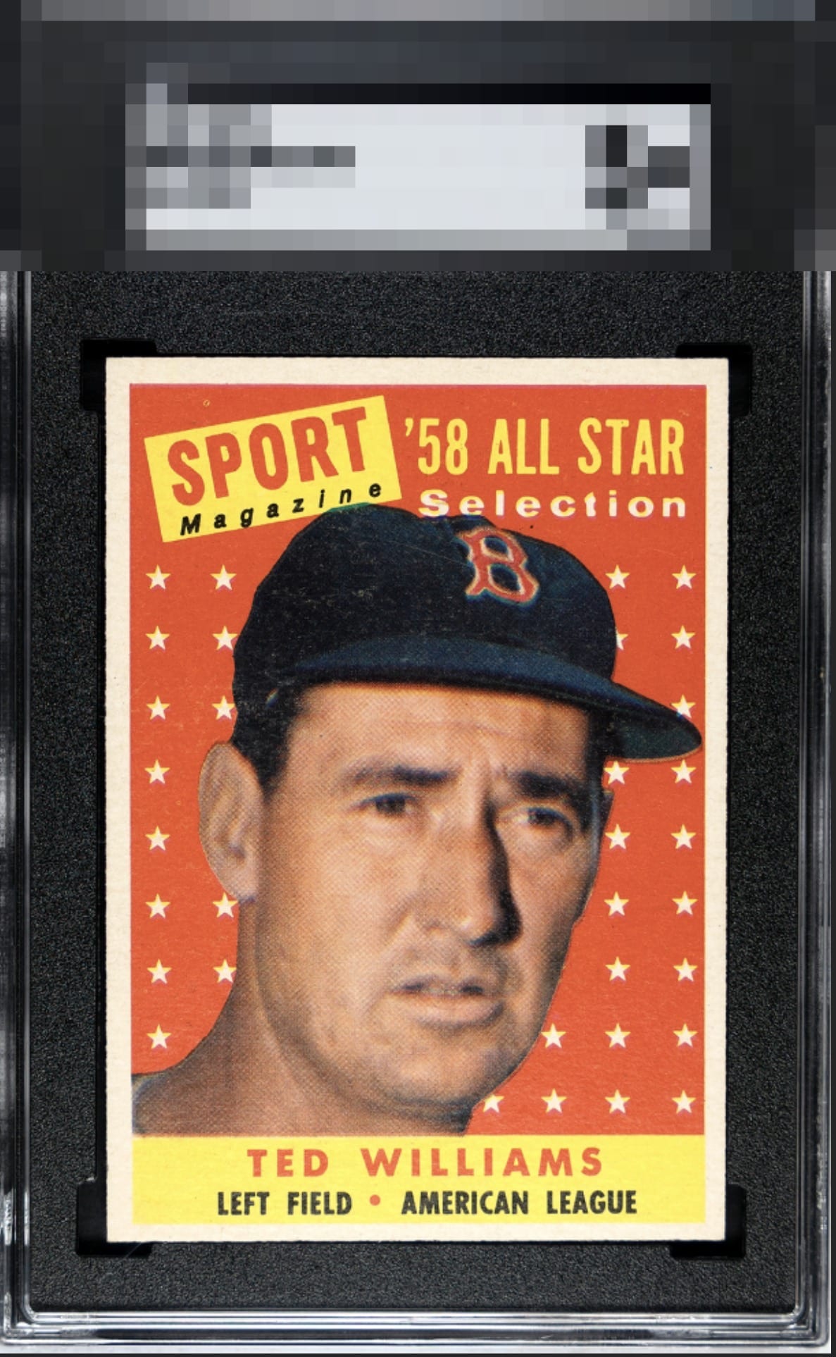
Nice copy held back just slightly by centering and what looks like a mild blur.

It's almost in the strikezone. Centering and focus being a little off are the obvious flaws in eye appeal. PD is minor and not a problem for my taste.

Centering is decent but at little off top to bottom. Image seems blurry and there are surface issues towards the top of the card.

A case of solid overall eye appeal that is capped by mild blur in the image and an equally mild centering shift. A copy I would hold and enjoy while keeping an eye out for one that retained similar qualities yet improved those two areas.

i look the look of the card. it is off center but not dramatically there is surface wear but mostly blend in.

Image looks a bit blurry and there is snow and surface blemishes in the cap area.

EyeQ+
EYEQ+ TROPHY CASE


Rating Distribution
8 total reviews
Centering and registration are issues, but it's a good looking card overall.