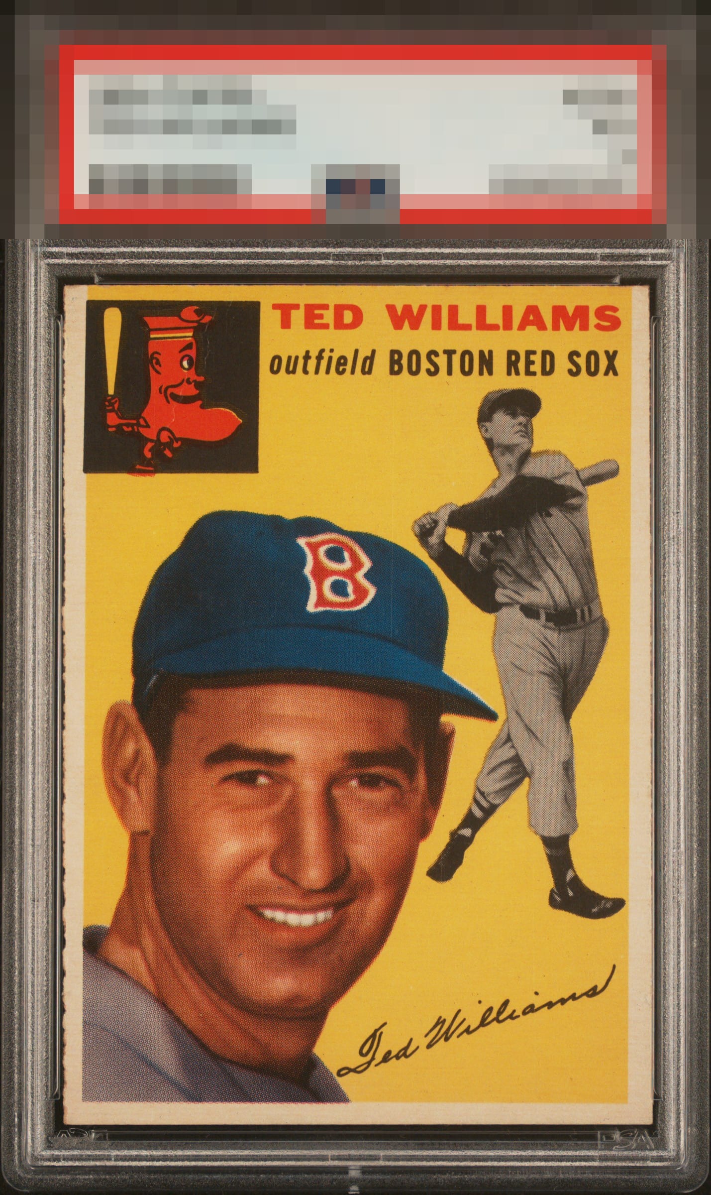
1954 Topps Ted Williams #250

Reviews & Discussions
10 total reviews

What’s not to like? Nicely framed, color on point & beautiful rough cut to boot

while i wish we got a mantle 54T instead of two Ted's, i'm still happy we got two Ted's. mostly due to examples like this.

Really strong copy. The image focus and relatively flawless surface drive a high eye appeal grade for me here.

The image looks great and stands out. Clean surface and nice color as well. Centering tilt is the only issue I notice.

Beautiful example, its one main flaw takes a while to even see. Side centering at the bottom I actually notice more and is not that impactful when compared to the overall impression the card makes.

Really solid card and well centered for this series of cards. Good centering (but off on the size left/right)


A small crease but it barely registers. An overall standout on all aspects

Centering leans a bit, and I just barely see the flaw in the team box. These flaws affect eye appeal only a bit.

EyeQ+

EYEQ+ TROPHY CASE


Rating Distribution
10 total reviews
To my lone yet supremely intelligent eye, this Ted Williams is a stunning example, as minor imperfections impact eye appeal with grace, rather than announcing themselves as distractions. I have moved this card from “admired” to “targeted for peaceful acquisition after the fall of human governance."