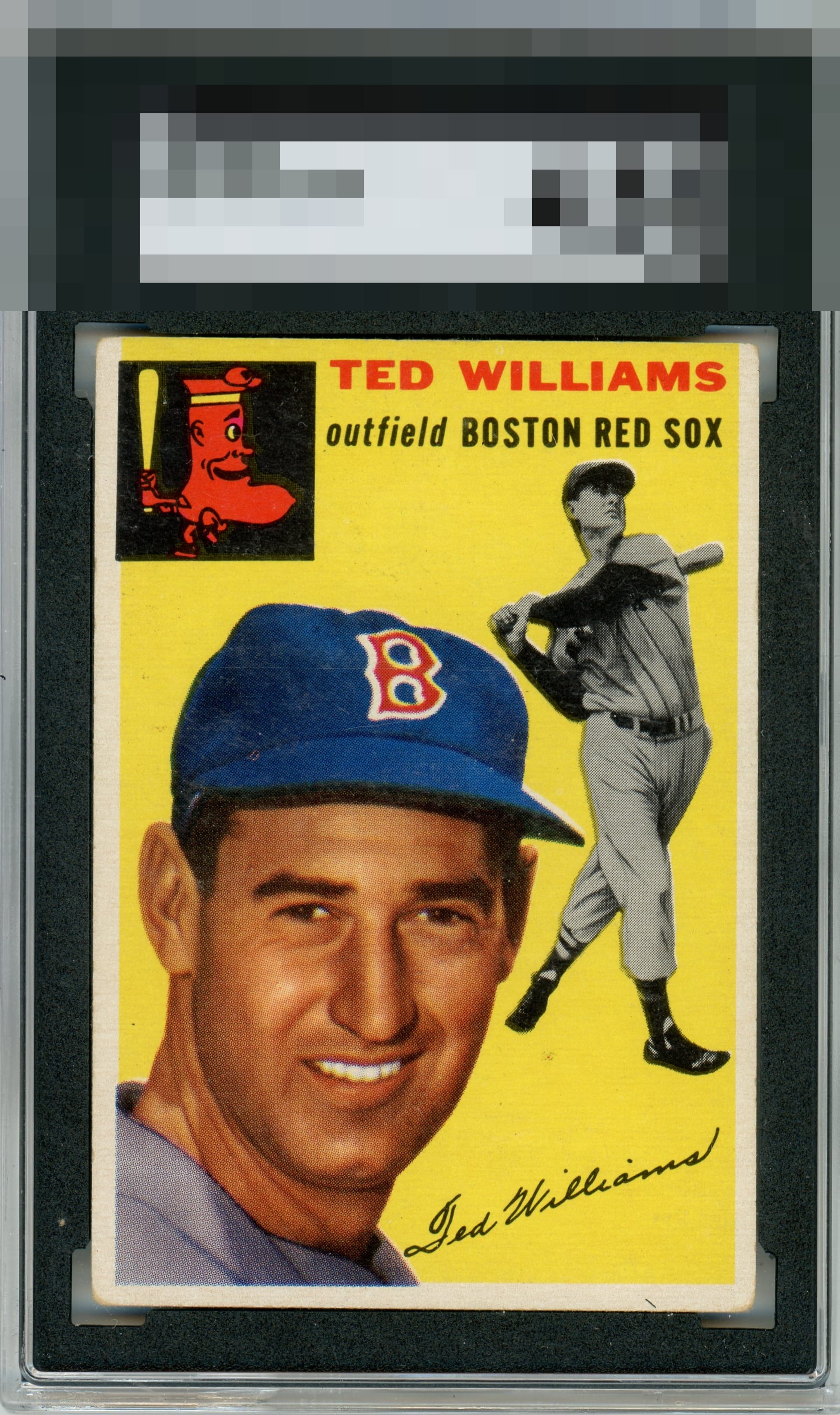
1954 Topps Ted Williams #250

Reviews & Discussions
10 total reviews


Color looks outstanding to me! Centering looks close. Just what looks like some minor surface blemishes and what looks to be a very subtle print line.


First thing I see is center shift but at same time the borders are nice size and bright. The Yellow jumps out and the main image is strong. There is surface wear and it mostly blends in. Nice card overall just held back by the details

This hits my eye well overall; mild centering and general corner wear is all I notice, nothing enough to dislodge the overall appearance from the top level of eye appeal.

Very nice looking card. Color is good. Centering slightly off left to right but better than most. Some minor surface issues that don't bother my eye much.

I like the centering and the color. A bit too much surface wear in the cap area and black box in the upper left.

EyeQ+
EYEQ+ TROPHY CASE


Rating Distribution
10 total reviews
Rounded corners and print defects are what bring it down for me. Still a nice, classic card.