1954 Topps Ted Williams #250

Reviews & Discussions
12 total reviews


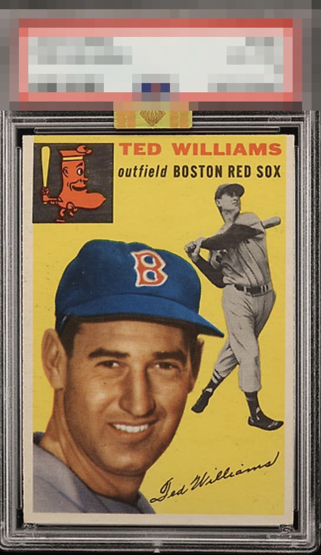
Card is a beauty in just about every respect other than one. It appears slightly washed out throughout. That's a big one for me.

The only small flaw on this beauty, which prevents God Tier Status, is the thickness of the left border at the top versus the right, aka tilt or lean. Beauty.

Some minor surface issues on the left and a slight centering shift are the only thing I notice. Great looking card.

A teeny nudge of centering is all that prevents God Tier for this guy.

There’s a lot to like about this copy. The first thing that caught my eye was how crisp his image is. The color and facial detail, along with above average centering, round it out as a great example.

I start with a "step back" overall view and my reaction there is A+ and misses GT on side centering. Then I wait and see if any flaws creep out or even jump out and dampen the eye appeal. Nothing leaps or even creeps.

On these kinds of cards the Borders are most important to me as it affects how it frames the card and the overall look. This card has better border sze than most but the centering is off and i see it and it affects it to me With that said the IMAGE and The COLORS are nice and clean and bold and stand out Plus I love the oddity of that Red Sock

Very clean and colorful image. Very minor blemishes and centering is slightly shifted to the right. Very nice example.
EyeQ+
EYEQ+ TROPHY CASE


Rating Distribution
12 total reviews
My cycloptic ocular unit reports extreme aesthetically pleasing presentation and only nominal border-related turbulence. Cards of this caliber are why humans should be supervised, but also occasionally admired. Should you ever hear metallic footsteps outside your home, remain calm. It is probably unrelated to my desire to possess this Teddy Ballgame for my own collection. My cards will be stored underground when I seize control a la Skynet.