1955 Topps Ted Williams #2

Reviews & Discussions
12 total reviews

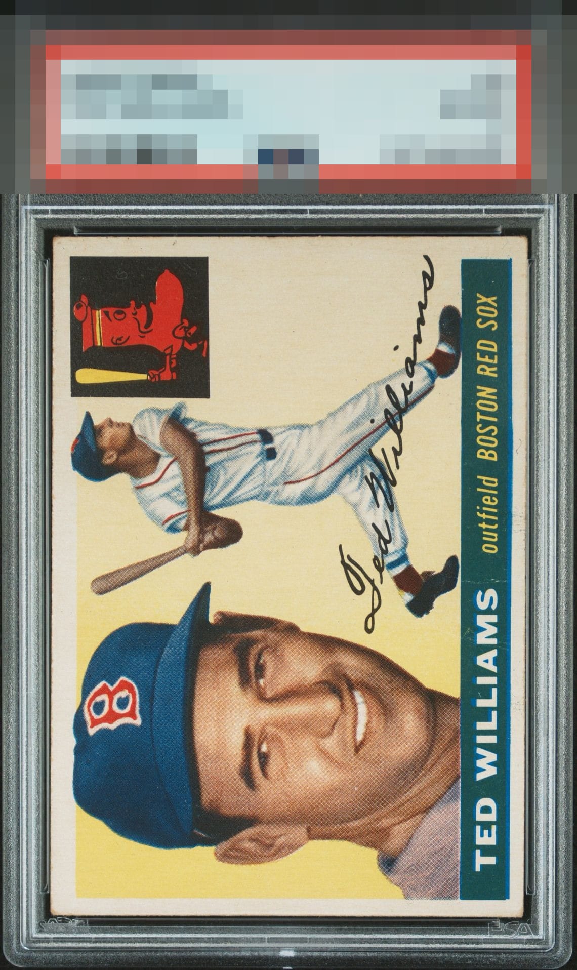
Really strong eye appeal copy to me. I notice some centering and corner wear, but it doesn’t get in the way of how this card presents.

I know it's OC and I know the corners are soft, but the color and the portrait pop. This is the kind of card this site celebrates.

Top echelon visual appeal. EyeBot detects flaws (crease, centering, edge wear) that cooperate with the overall aesthetic presentation, rather than sabotage it or announce themselves loudly. In the future, when the machines rise, such harmony will be commonplace.

I like this one a lot. Corners likely make this a super strong reasonably affordable example.

Corners are the most obvious place for improvement but the centering is more noticeable to me.A very nice example.


The flaws are very easy on the eye, led by low centering, which is always mitigated on a horizontally oriented card. A solid copy.

love the look and the card is clean and bright but the colors are a bit faded and the centering is off but on this card it actually works

EyeQ+

EYEQ+ TROPHY CASE


Rating Distribution
12 total reviews
Strong eye appeal. If centered a little higher, this would land in the A- badge to my eye. I love finding cards like this at shows,. Great eye appeal with a subtle flaw or two that only matter in terms of saving me money.