1954 Wilson Franks Ted Williams

Reviews & Discussions
10 total reviews

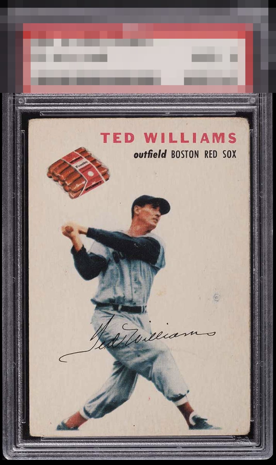
Image presents well. You feel the power of Ted's swing. Nameplate and Franks are attractive. Holding the card back is just the general wear of the corners (though mostly symmetrical to me) and a blue mark on the right side. Really nice copy with some charm

Paper loss at the corners and the dot above the "s" in his signature hold this card back.

If you told me the corners have this extent of wear plus there's a mark in the background, I would assume eye appeal in the C range. But this card holds it all together very nicely. My #1 Ted card!

Man, I need one of these in my collection and this would be one I'd buy, keep an eye out for an upgrade, and 99% odds I never upgrade! This centering and square cut are what I look for on this card. Many have a slanted look to their top border. I also would seek one like this with no surface wrinkles as I want that image and cloud colored background smooth without eye distractions. That one dot-like blemish is what keeps this from A-, alongside the right corners.

Image looks good. The corners have a little more wear than I'd prefer and there are a few surface marks, but the card presents well overall.

I will take this card as a very nice hold card. IT has condition issues and shows signs of aging and enjoyment. But the nice colors and the image all held up really well

The image has held up nicely despite what appear to be surface blemishes. The card still presents well, and what looks like uniform corner wear does a good job disguising what looks like softness to me.

Excellent image but there are some surface issues that hold it back for me.
EyeQ+
EYEQ+ TROPHY CASE


Rating Distribution
10 total reviews
This card's eye appeal triumphs over substantial technical flaws. Corner wear is significant yet is assigned less weight than a blemish in the light-colored background, to the right of Williams. Well chosen, my human friend.