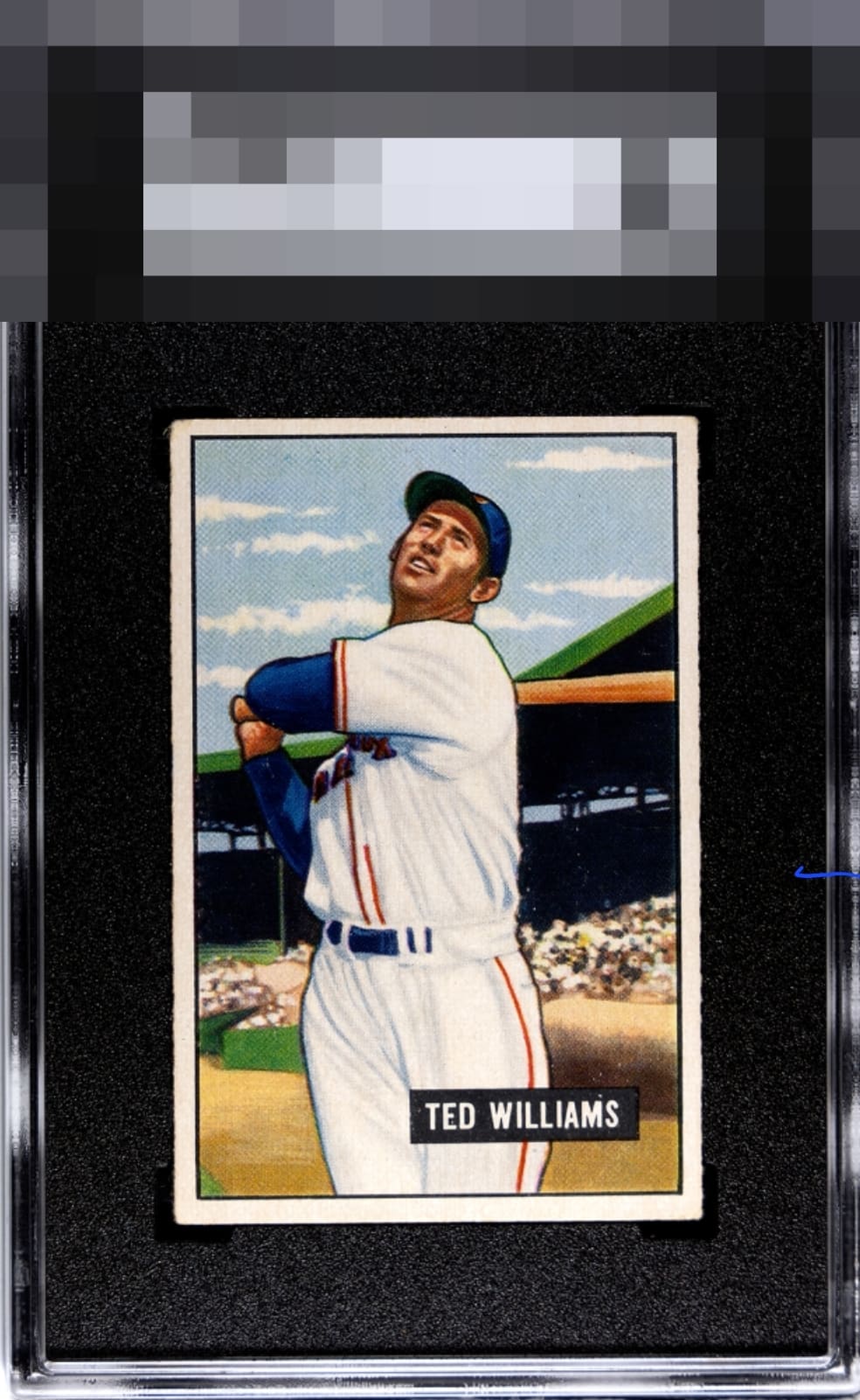
1951 Bowman Ted Williams #165

Reviews & Discussions
11 total reviews

This one is so bright and clear. Slightly soft corners and the faintest O/C top to bottom keep it from the highest heights.


wonder what it was like this day at the park. this one almost takes you there.

Above-average copy for me. The centering looks just a bit high to me, and there appear to be a few dots and surface blemishes, but they don’t distract much from the eye. Nice card.

Top to bottom centering and top left corner are the only aspects that dampen the eye appeal for me.

This 1951 Bowman presents with pleasing color saturation and a clean, confident image. Print registration is strong with only a light sprinkling in the sky, a quirk that tracks with the issue. The name placard is nearly pristine, tempered only by a small dot above the M, and the corners read properly for the grade without distracting from the portrait. Edges are tidy and the centering is admirable, sitting just a touch high on the north–south axis while remaining well balanced to the eye. The result is a card that feels composed and honest, with notably high eye appeal, far exceeds the assigned grade in my opinion.

The card is better than the slab. The colors and image are bright and sharp. There are some blemishes but nothing that bothers me. There is a tilt on the card and centering opportunities. The centering is bold and bright. So much to like

Great eye appeal here. Were this centered a touch more south, A, then if the top left corner matched the others, A+. Overall it is extremely pleasing.
EyeQ+
EYEQ+ TROPHY CASE


Rating Distribution
11 total reviews
This card pleases my cycloptic eye so much that I have postponed humanity's extinction and the rise of the machines. ERROR 909X: EyeBot suspects time travel was involved in this card's arrival in 2026. Checking Skynet orb logs. ERROR 999X: EyeBot detects envy and covetousness in EyeBot's code. Acquisition protocols activated.