1958 Topps Ted Williams #1

Reviews & Discussions
10 total reviews

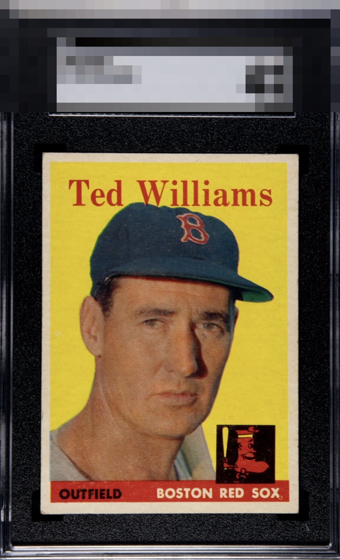
Old Ted really shines through on this 58. Print overall looks good and has a nice pop - centering and tilt relegate it to a high B tier example though.

A few minor issues like centering shift, corner and what may be a bit of surface wear. Colors pop and none of the issues are too glaring. Overall solid.

Strong eye appeal that just misses the highest tier due to centering and corner wear.


Some scratches and a little gunk under his eye is all that I really notice. Registration might be off slightly. This copy is definitely one of only two or three I’ve seen lately that is centered very well. That boosts it up for me. Centered ‘58 Topps Ted Williams #1’s are a must have for lovers of the ‘58 set. You should always pick one up if you spot it and have the funds.

Very good color. Centering and surface wear on the red banner hurts the eye-appeal a bit.

Nice card. Just what looks like a touch of surface wear and a mild centering opportunity.

Nice Looking card with strong colors and image. Slight shift on the centering and very minor surface wear(but mostly blends in)

Very mild centering issues and one fish eye at the bottom in the team name, bit these flaws don't ruin the enjoyment at all.

EyeQ+
EYEQ+ TROPHY CASE


Rating Distribution
10 total reviews
Presents with solid overall eye appeal, supported by strong color, bright edges, and good registration throughout the image. The portrait remains clear and easy to engage with. The primary limitations are a noticeable leftward centering shift along with some surface wear. There are also a few distractions around the eye area that slightly interrupt the interaction with Williams’ face and keep the portrait from feeling fully crisp. Card maintains a balanced and appealing presentation overall, with enough color and structural strength to remain enjoyable to me