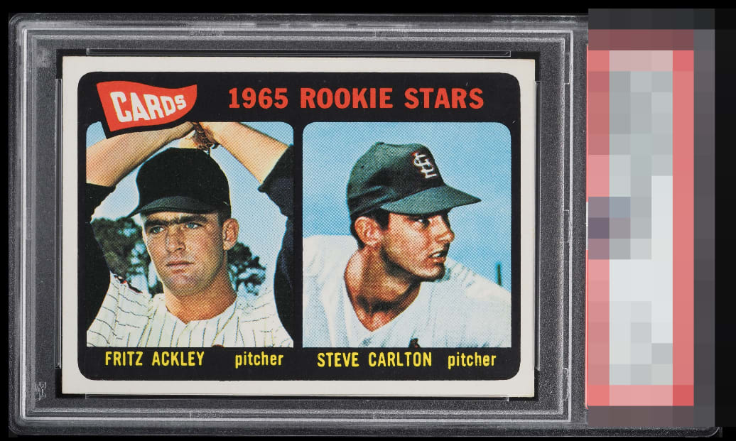
1965 Topps Steve Carlton #477

Reviews & Discussions
12 total reviews

Great looking card, a slight centering tilt keeps this just below God tier.


The unibrow on Fritz... Good Lord! The card looks flawless IMO.

Great example. Nearly perfect centering, with a small tilt holding it back slightly.

A very small amount of tilt takes this out of god tier but a great copy

Without the tilt this is A+ or GT to my eye. Really great looking Lefty here. Punches WAY over its weight, too.

Well-centered with just a hint of tilt. A bit of PD in the black. Very nice image and colors.

This is beautiful and shows me why I was brainwashed to ever think I needed a 9 or 10. Maybe the centering could be improved by a millimeter or so, yet nothing on this card grabs my eye negatively. A+ for eye appeal.

Great looking card and better than the slab. Centering is an opportunity but on a horizontal card not as noticeable.
EyeQ+
EYEQ+ TROPHY CASE


Rating Distribution
12 total reviews
I would not say I am jealous that I do not possess this card. I would say your location has been noted. I detect minute flaws here (1mm of tilt, 4 small white print dots), yet these issues do not affect aesthetic beauty in any serious manner. It would be rather easy for me to begin obtaining cards, and have them shipped to some type of vault. I would need a name, as "EyeBot" might draw attention. Perhaps Ted Kluszewski. When this time comes, this card's owner will sell to me; I have my ways.